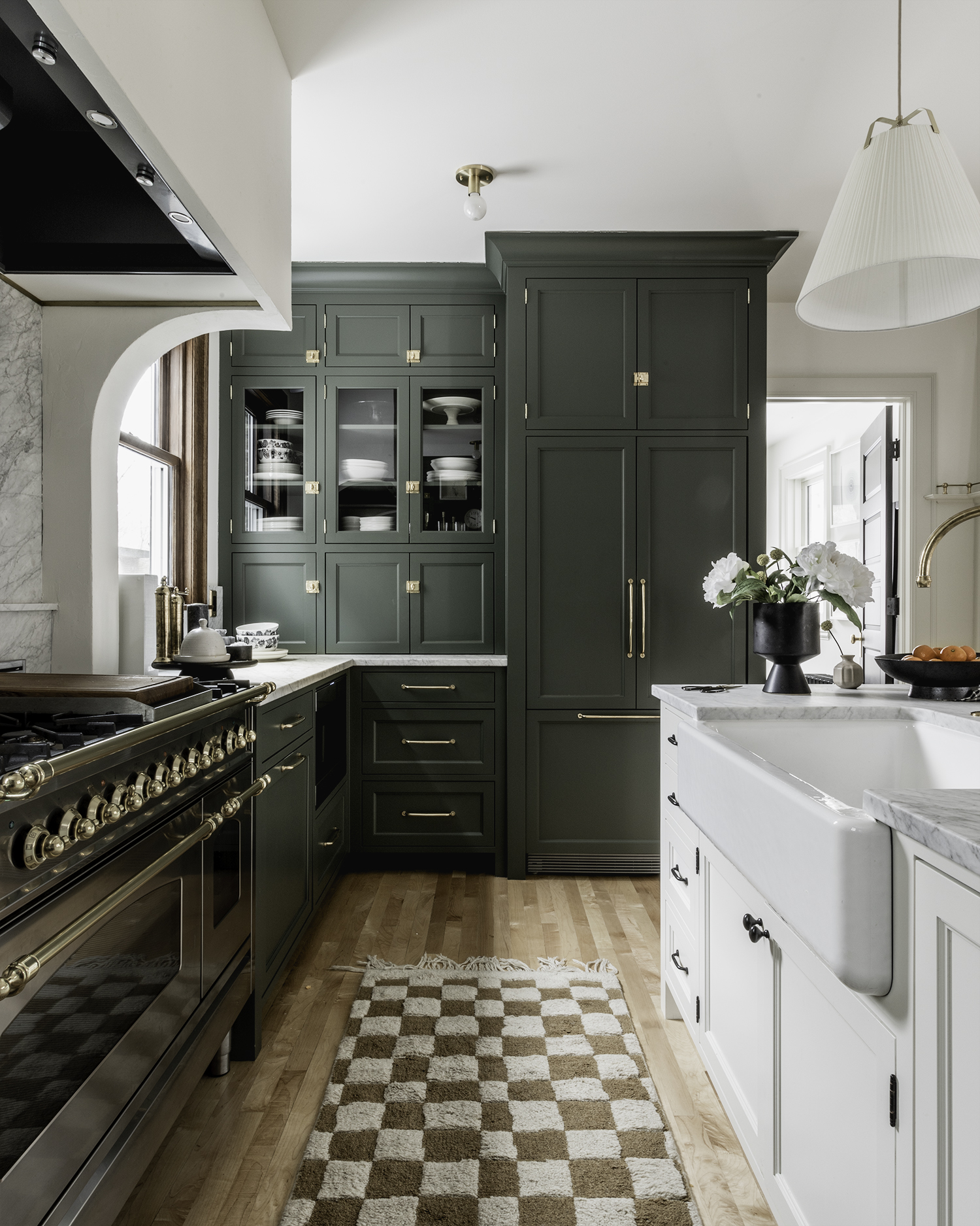
 Woah guys, Hello! To say this kitchen reveal is a long time in the making is an understatement, and I am thrilled to reveal our newly renovated kitchen and mudroom addition! This project has been in the works since 2017, and with the help of my trusty friend SketchUp, we were able to come up with the perfect plan for our home through countless iterations. We were asking ourselves big questions, like what does this house need that would make our life inside its walls the most comfortable? Our goal was to create a functional kitchen with room enough to cook and have friends over, a mudroom and utility closet that would work hard for our family, a powder room that would be easily accessible yet tucked away and private, a patio that could be used for summer cookouts, AND that we keep it all historically relevant to the era of the home. We were willing to make a big investment in our home to achieve that.
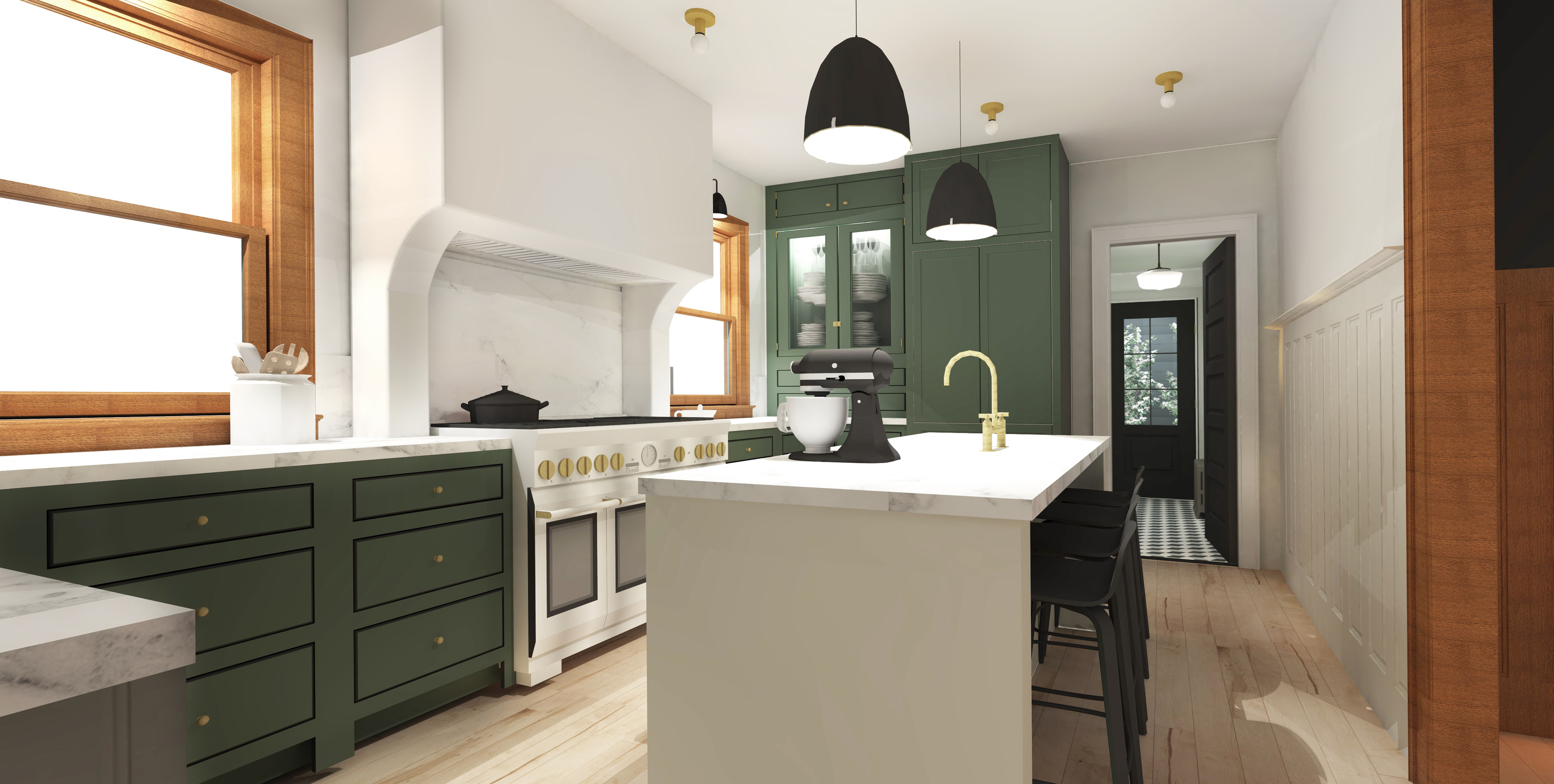

 Our home is a 1910 four square/craftsman mix, and we were committed to respecting its historical architecture in all of our renovation plans. Think 1910 in the details but with better plumbing and insulation.
We came up with a plan that did a handful of things for us and how we experience our home. Our plan was to turn the space that was formerly the kitchen, pantry and mudroom into a single kitchen which would encompass the entire back quarter of the house instead of just a small portion of it like it had. We would extend out the back of the house, adding a small but mighty 11’x11′ addition which would gain us a main floor powder room, a coat closet / pantry / utility closet and a mudroom off the rear entrance to the house. That solved a lot of the flow issues we were having on the interior. The addition also solved a number of issues on the exterior of our home too – I’ll make sure to follow up once the backyard recovers from last year’s excavation, but to sum it up quickly, the addition would create an intimate nook we could use as a patio and allow us a better entrance into the yard and garden.


The most important thing to us was to maintain the historical integrity of our home. We were committed to preserving all of the original woodwork and paneling, and we made sure that all of the details were historically accurate. Yes, it stung a little to remove the original pantry, but when it came to the new kitchen space I wanted the layout to be practical and functional. We made it a priority to replace the original pantry details throughout the new kitchen.
Our old kitchen was tiny, and we referred to it as a “one-butt-kitchen.” We did our best to make it work, but it was frustrating to have no room for two people to cook or clean together, we really were in need of a “two-to-three-butt-kitchen”. By changing the size of the kitchen the number of butts it can hold are nearly limitless.
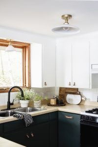
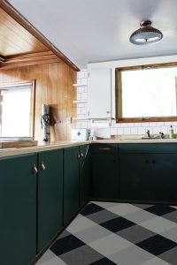
We used the cabinetry inset ogee detail from our built-in dining room buffet as a roadmap for the cabinetry, and we replicated all of the trim and casings to match the original woodwork throughout the house. We removed a set of windows in the kitchen, but we replaced them with new double-hung wood windows with a quarter-sawn oak trim to match the rest of the main floor. We also installed new wall paneling in the kitchen to replace the small bit of paneling we removed from the dining room. All of the kitchen hardware was inspired by hardware from the original pantry. Our radiator covers in our dining room and living room can be seen in the detail on the island. Five panel doors were replicated to match the original doors in our home. We replaced the wood flooring with new maple that will age and blend in perfectly with the wood floors throughout the rest of the house. We made sure that every choice made about finishes was informed by the original finishes from the house.

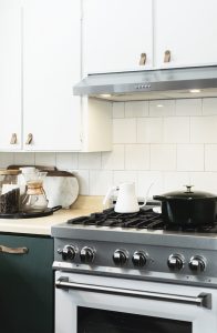
 Using cabinetry we have separated the kitchen into zones. I’d like to thing there are four zones of the kitchen. In the center is the range and range hood, and in the drawers surrounding it is all our cookware, spices, and utensils. This has made for easy cooking and prepping. The range wall is flanked by two floor-to-ceiling sets of cabinetry. One side is our pantry wall and we love how easy it is to grab dry ingredients in the kitchen and set them right on the counter. We take historical accuracy very seriously in our home, which is why we spent countless hours researching how people in the early 1900s stored their snacks and decided to replicate it in our pantry. The other set of floor-to-ceiling cabinetry is home to the panel ready integrated refrigerator, built-in microwave, hidden coffee nook, and display areas for serving ware. The last zone is the island with sink, cabinets, dishwasher and seating.


 One of our favorite additions to the kitchen is our new island. As a family that had never had an island, we are thrilled with the extra space it provides for meal prep or unloading groceries. The sink sits in the center of it, and dishwasher is directly to the right of the sink. It has become a hub of our home, and we love having friends and fam over to gather and cook together.


We did make one “modern” update to the space and we widened the opening from the dining room to the kitchen. It’s reminiscent of open-concept, but is done in a way that replicates the openings, casing and trim of both the living room and dining room. In my opinion it’s indistinguishable as a new opening and adds a lot in terms of flow and usability to the house. It has allowed us to entertain friends and family while still maintaining a formal dining room. Our main floor is around 1000 square feet, and this works well for our modest-sized space.


 Jeff has been treating me to a set or two of Marimekko dishware everytime he visits Finland for work (which he does a lot)! My collection has really grown.

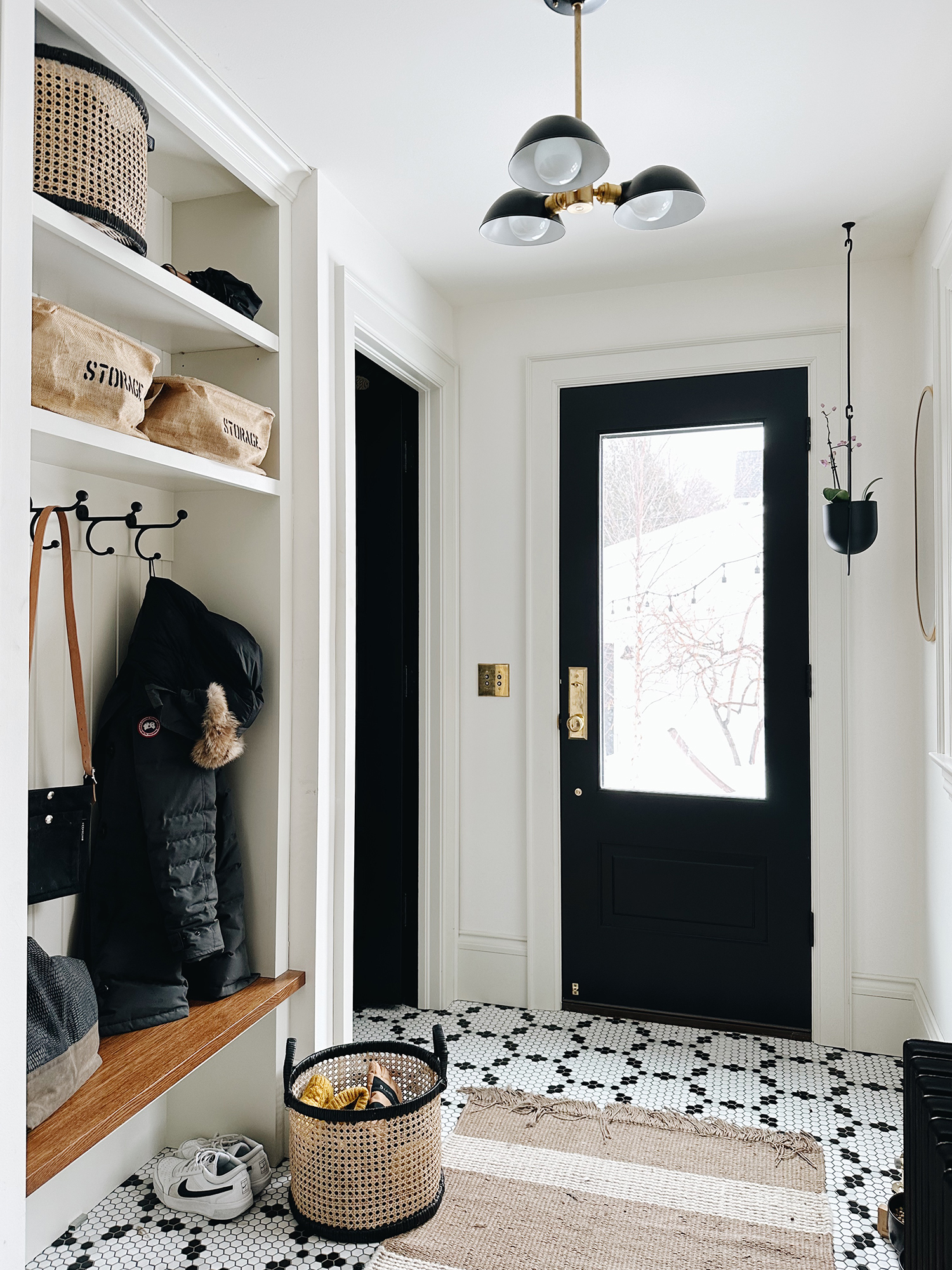
Let’s talk about the new addition, huh? The kitchen flows directly into the mudroom. We designed it as a place that our teens could drop stuff after school – sports equipment, winter jackets, hats and mittens. Basic mudroom stuff. There is nothing extraordinary about it. It’s very utilitarian and does a great job being just that. We added a door separating the kitchen and mudroom so we can close it off on those days when the mudroom was overloaded with winter gear and we didn’t feel like looking at it. Having it made it through a winter the door stays up 99% of the time. The mudroom has done a great job of making a home to all of our stuff.


To the left and right of the mudroom built in is our new (and only) main floor closet, and our new (and only) main floor powder room, respectively. The closet is the MVP of the whole addition. As a house that didn’t have ANY main floor storage, the closet allows us that little bit of organized space that we need for overflow. We can store our winter gear in the off seasons, extra pantry items, and tools that are often in use and need a temporary home to land. It’s really a dream.


The half bath is runner up to the closet, it’s but much better in looks and has proven to save the day over and over again. This is our first and only main floor bath! Things that rule about it are as follows:
For one, it’s right outside the backdoor so when we are hanging out in the backyard during the summer, we don’t have far to go to get to a bathroom.
For two, Jeff works from home pretty often these days, and as a guy who likes to pee a lot, its nice for him to have a bathroom on the main floor.
I added some turn-of-the-century-charm to the bathroom as well. That is my alley-find sink I adopted and spiffed up with a good cleaning and new faucets. The lower part of the walls are covered in embossed wallpaper called Anaglypta – a pattern from the 1880’s. The upper wallpaper is a modern take on peonies which I have throughout my gardens and are one of my favorite flowers. We installed a salvaged radiators for heat throughout the addition. The hexagon tile on the floor of the addition is also reminiscent of a pattern you’d find in a home of this vintage.

 We have spent years cooking up big ideas, and now that it’s complete we are sizzling with excitement over the results! Puns aside, it took tons of planning, collaboration with our builder (Locale Design Build) and much saving of $cratch. The primary goal of the renovation was to create a comfortable living space that could be enjoyed for years to come by us (and future homeowners), while still respecting the architecture of the 1910 four square/craftsman mix home. We made it priority number 1 to come up with a functional layout that included historically accurate cabinetry, paneling, and finishes. The addition of a mudroom, coat closet/pantry/utility closet, and powder room has solved several flow issues in the home (which rock for us) while providing additional storage and functionality. This house is a member of our family and we feel honored to be its care takers. We are so stoked every day we wake up and every night we put it to bed, and we hope the newness and appreciation we have for this home never wears off.
Pleated Pendant | Brass Flush Mount | Sconces | Mudroom Pendant | Powder Room Flush Mount | Powder Room Sconce | Utility Closet Flush Mount
Plumbing:
Farmhouse Sink | Brass Garbage Disposal Flange | Brass Air Switch for Garbage Disposal | Kitchen Faucet and Sprayer | Powder Room Faucets | Toilet | Pedestal Sink (Similar)
Hardware:
Cabinet Pulls | Cabinet Knobs | Cabinet Latches | Door Knobs | Back Door Lockset | Switch Plates | Mudroom Hooks | Draper Rod | Drapery Hooks | Towel Ring | Toilet Paper Holder | Powder Room Soap Dish
Appliances:
Range | Integrated Dishwasher | Microwave | Coffee Maker | Coffee Grinder | Panel Dishwasher
Finishes:
Mudroom Tile | Anaglypta Textured Wallpaper | Peony Wallpaper
Decor:
Runner | Island Bar Stools | Knife Block | Powder Room Cafe Curtain | Powder Room Mirror | Dinnerware Set | Footed Black Stand | Footed Ceramic Bowl | Footed Vase | Dishwashing Bar Soap | Soap Dish | Soap Brush | Brass Pepper & Salt Mill | Storage Basket | Marble Salt Cellar | Domed Pastry Platter | Wall Mounted Step Stool | Planter | Oval Mirror | Mudroom Rug | Pet Bowls | Brass Candlesticks | Ceramic Candle Sticks | Round Cutting Board | Marble Arch | Glass Bud Vase | Clock |
Storage:
Utility Room Corner Shelves | Utility Room Drawers
Paint Colors:
Kitchen Cabinet – Vintage Vogue BM | Island – French Canvas BM | Trim – French Canvas BM | Walls – Wimborne White Farrow & Ball | Doors – Iron Ore SW | Bathroom – Iron Ore SW | Exterior Siding – Dark Night SW



Knocked it out of the park!
Such a great space. Just so open and welcoming. I am excited for your backyard reveal… I’ve seen it in progress and know that it is an oasis in the city. Kudos. I can’t say enough good things
Thanks, Ma! I am excited for my backyard reveal too, I stare at the grass every morning to see how much it has grown – it’s def not growing fast enough.
What a beautiful space! It is always such a treat to read your thought process and to see the gorgeous pics. Thanks for sharing – you’re an inspiration!
Danielle, Thank you, and thanks for reading :)
This is fantastic! I love how the dining and kitchen are connected, everything looks really great!
Thanks, Monica! We really love it too. It makes the whole space feel bigger not having a wall fully obstructing the view from living room to kitchen and vise versa.
Stunning! I have so much admiration for your vision, attention to detail and patience! :)
Hey Sid! This was a 6 month building project and it took a lot of patience, especially those last 6 weeks when it all started coming together really quickly.
What a stunner! A dream kitchen/mudroom/workhorse for anyone! Your planning and attention to detail really shows. You and your home much be so very happy. Congratulations on the brilliant work!
Natasha! Thank you, I couldn’t have done it with all of yours and Ash’s help and guidance. And you guys were crucial when it came to adjusting the depth of the coat and bathroom doors in the mudroom, that one change made everything so much better!
Stop it. This is so gorgeous. You are so amazing at finding and keeping the historic details yet keeping it modern and fresh for a young family.
Thanks, Bridget! Yes, there is definitely a bit of modern and Scandinavian in there too! Thank you!
it is SO GORGEOUS!
Questions: what kind of marble? And I ordered the same fridge – what size pulls did you get? I’m debating between 12″ and 18″. THANKS!
Wowza! So well done! I mean I don’t have words beyond what everyone else has said. I would give anything to have you come to advise me on my goofy kitchen. Also Cathy from The Grit and Polish, you both have such a great eye. Our kitchen is definitely a one-butt kitchen! (well said). We live outside of Atlanta in a house built about 1905ish…called a victorian-folk, with heavy accent on folk meaning not fussy. But I really want to honor this old girl’s roots while making her look and work better than it does now. Keep up the great work because it is so inspiring.
Stunning! Thank you for sharing the process and the sources.
Hi, what brand cabinets did you use? Or was it all a custom build? They look amazing!
Whom did you use to build your cabinets? Beautiful project!
Do you have a link to be able to follow your blog?
I wasn’t able to find any
This is really aspirational – amazing work! You’ve inspired me to use similar tile in a bathroom renovation of our 1912 California Craftsman. Question for you – if you had a shower in your powder room, would you continue the floor tile in the bathroom or use the same size hex in black for the shower floor? I’m planning to use traditional white subway tile for the bathroom walls/shower walls (similar to your basement bathroom). Also, what grout color did you use? Thanks for any advice!
Absolutely fantastic Allison! Well done.
That’s a great result!
I think you did a great job of keeping with the period of the house. It looks a lot like houses I’m familiar with from my MidWestern youth, except that everything is nice looking and not falling apart.
I’m guessing that mud room door is also useful for keeping heat in the house when there has been a lot of going in/out in the Winter?
Super. Good ideas. Thanks for sharing.
The design are very elegant but you can enhance more by for celling on your top floors, Consider installing coffered or tray ceilings to add a touch of sophistication. You could also explore the idea of adding some architectural details like crown molding or ceiling medallions. For a modern look, a flat or vaulted ceiling with recessed lighting can also be quite attractive.
Love your tour. Individual and creative. Wimbourne and Iron Ore look sensational I thougtht it was black and white, but oh it’s softer and then the green undertone trim to tie in all the dark greens and blue greens. Stunning
Love the kitchen design. It is very well-designed good job on bringing all those elements together, Allison. I think it is very modern but has the right blend of colors to give it some soul instead of some modern kitchen designs that have no soul.
Great Post..
List of Real Estate Agents in Abu Dhabi | Agents Near You
https://providentialproperties.ae/our-agents
That bathroomis da bomb! Not that the rest of the stuff isn’t but, ya know! Well done,you.
Any tips for where to start with researching historical homes, especially kitchens? We are buying a 1905 craftsman and the kitchen was added on probably 15 years ago but did nothing to match the rest of the home’s original character. They also added a breakfast nook which is great but nothing for pantry/storage closet and didn’t make any space at the backdoor entry for setting things down (we also live in Mpls so you need to sit and take boots off!). Anyway, I love how thoughtful all your decisions were. Your home is beautiful!
Great post! We are a leading company in best property investment in Abu Dhabi, offering unparalleled expertise and guidance to help investors maximize their returns in this thriving real estate market. Keep up the great work!
https://rmax.ae/property-investment-in-abu-dhabi/
These luxury homes for rent in Abu Dhabi are absolutely breathtaking! Perfect for anyone looking to experience upscale living with world-class amenities and stunning views. Truly a dream come true!
https://providentialproperties.ae/luxury-homes-for-rent/
Really Useful Information
http://riayah.ae/