Hey-O Guys! You won’t even believe when I originally started working on this post! It has been nearly 3 months! It’s been weighing on me too, I often sit down to work on this post, and I just don’t feel right about it so I put it away. The problem with the post was not having to write it, but the actual design process. If you take anything from this, please let it be that slow design is good, and you don’t have to always have all the answers (even though having all the answers usually rules).
I’ve had that lighting strike moment before, when you’ve been just waiting for a solution to a problem and then wham-o(!) you figure that shit out! I know by know that if I think about something long enough I will find the solution. I kept waiting for that moment with this space, and it just wasn’t coming. I was worried that I’d make the wrong decision and would always be doubting what I had done.
Let me start back three months ago. We have this eye sore in our house called the stairwell and upstairs hallway. Think mangled baseboard, popcorn ceiling, plumbing access panels, broken light fixture. Pretty offensive. This space has been left untouched because design-wise it is has the most obstacles to overcome and legitimately requires the most thoughtful design of any space in the house. The two spaces (stairwell and hallway) have walls that intersect in a corner, and the staircase is visible all the way to the main entry. Designing this space involves incorporating the aesthetic of the entry (which I finally figured out and love), the stairwell which is super unattractive, and the upstairs hallway which leads to all three bedrooms and the bathroom. Talk about pressure.
The biggest problem was where to begin and end the painted walls. For instance if I were to paint the upstairs hallway one color, that color would have to either continue all the way down the stairs or stop abruptly in a corner – which could have been kind of okay if I had to, but I was desperate for a better solution. If I wanted to paint the ceiling, that color would have to continue on the staircase ceiling because THEY ARE THE SAME CEILING! Lastly, if the stairwell was painted, where would it stop? The stairwell intersects with walls from the entry way and even more problematic, can be partially visible from the entry. UGHHHHHH!
You can start to see why this had taken me three months to figure out. The biggest thing was not wanting to touch the entry, because its perfect as it is. It had taken be six years to finally figure out how to make that space visually work with the rest of the house, and I wasn’t wanting to mess with that.
Just today, I finally started throwing paint up on some of the walls, just to test colors and hopefully get the ball rolling. (Insert lighting strike and thunder) It finally occurred to me. I could take a hint from the entry way where I only painted black starting at the baseboard and going 1/3 of the way up. I could use that color blocking principle in the stairwell to define the space. The paint line would occur right at the entry way ceiling level, and then continue up into the hallway. Then the stairwell would reference the entry way, and together it would all make sense! You guys, this will be one cohesive space. Oh my god. I am so relieved!
To commit myself to the project I bought this huge af brass mirror back in December. Besides being fucking awesome, it will bounce light around this dark space, plus I think the scale of it in the hallway will surely rule.
Brass Railing
Our upper staircase has a beautiful brass railing, however the railing gets lost next to the current paint color and doesn’t stand out. It has the potensh to be a really cool feature in our house.
Wood Trim Details
The woodwork on the stairs and railing is beautiful, we’re lucky to have such a pretty staircase and entryway. I think there’s a way to show off the dark stained stairs with a dramatic paint color. If I’ve learned anything about this tone of wood is that it loves to be paired with dark wall colors.
Tall Ceilings
There are huge 20′ ceilings in the stairwell, normally this would seem grand as shit, but without a proper light fixture and an endless field of off-white paint that shows every bit of texture on the wall, it looks sloppy. I feel like the stairwell is a missed opportunity (but not fer long).
Narrow Hallway
The upstairs hallway is less than 36″ wide which I’m sure is not up to code at all. Besides safety, this narrow hallway leaves no opportunity for any shelving or a gallery wall. Because kids are basically oafs and have no control of their bodies, frames would be getting constantly knocked into every time a boy decided to use the bathroom. Can you even imagine if I were to hang shelves?
White Popcorn Ceilings
Just NO, either scrape ’em down, or disguise them with dark paint or both. The easiest fix would be to paint them a dark color to minimize the shadow contrast made by the popcorn. The downside to painting this would be that the paint makes the popcorn even more difficult the remove at a future later date (most likely in the way future). The upside to leaving the popcorn ceiling is not having to scrape a ceiling 20′ in the air while hanging over a staircase.
Two Plumbing Access Panels
Do you have plumbing access panels in your old house? How do people of the modern era deal with this? I don’t feel like I ever see these sorts of things in more modern homes. On the hallway wall, we have a 2′ x 3′ panel on the opposite side of the bathtub in the middle of the hallway. It’s SO ugly, you guys! The worst part is that there was baseboard removed to make space for this ridic amount of rarely used access. There is also a 12″ x 18″ panel in the middle of the stairwell to service the toilet. I’d rather someone just break a hole in the wall any time it needed to be accessed, I mean, c’mon!
Missing Baseboard
The access panel leads me to the missing baseboard in the hallway. Luckily the missing baseboard in located in a small section of the hallway. I’m pretty sure I could find a piece of baseboard to replace it at the salvage center without having it match exactly.
Continuous Paint Color
THIS IS THE BIGGEST PROBLEM! The paint color in our entry way leads continuously up the stairwell and into the upstairs hallway. A few summers back I came up with a solution to paint the bottom 1/3 of the walls in the entry way black. This added much needed contrast without having to repaint the entire stairwell and hallway. Not only that it gave me some time to dwell on (aka avoid at all costs) what the hell I was going to do to this space.
Missing Light Fixtures
This isn’t too hard to remedy. The light fixture in the hallway needs to be replaced and it would do the stairwell a great service to call an electrician and add a box and switch so that we can illuminate our dark stairs. More than anything it would all be an excuse to add lots of brass to everything and help accentuate that beautiful railing.
I’m still trying to decide between the same black I use in the entry and dining room, or going with a dark blue like Hague Blue from Farrow & Ball. I still haven’t decided, but if you feel like weighing in, please go right ahead. I’m also debating between painting the trim for a tone-on-tone look in the upstairs hallway or sticking with white. I love the look of the tone-on-tone but am worried that it will be too dark for a hallway. What do you think?
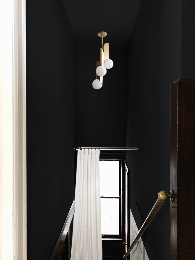
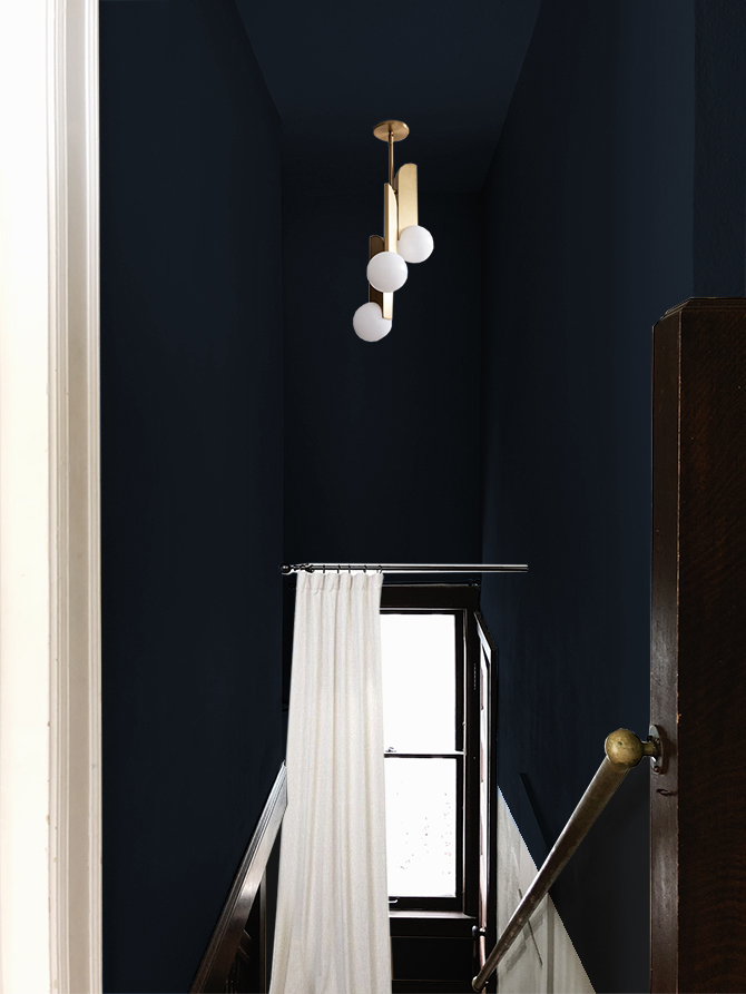
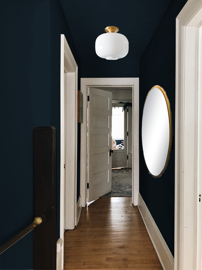
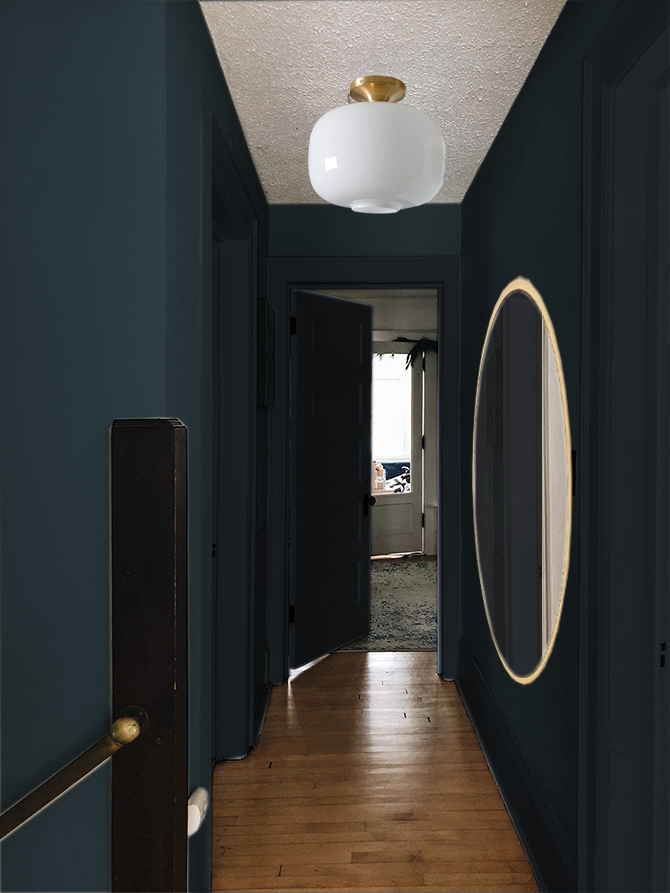
Having this project figure out means that I can go ahead and start refinishing the four (OMG, 4!) doors that lead to the hallway. Super stoked to share that process with yas.
Current Shopping Wish List




Love seeing your beautiful house come together, especially these tough areas (Our house has similar woodwork/stair issues). My vote is dark blue and white trim!
jennblogshere.com
Thanks Jenn! I love our house, but I could’ve never imaged how much trouble the woodwork and stairs/hallway would give me.
Seconded! :)
Please disregard these suggestions at your leisure, but what about continuing the baseboard colour that’s on the stairs into the upstairs hallway? I always find treating staircases, landings and hallways as one continuous space logical. It’s only when you have to open an actual door into the next room that the the colours, themes change. Presumably this would involve stripping the upstairs baseboards to get the exact match, but with a dark wall colour, you might be able to get away with just painting them a similar (very matte) colour to the stain. The other suggestion is to cover up the popcorn ceiling with wood panelling, shiplap or t&g, (avoiding the rustic), again with a colour similar to the baseboards or perhaps the lighter colour of that door halfway up the stairs. Taking it all the way out, even over the stairs, to the window. It looks like that part of the ceiling is higher than the the downstairs hallway. It would have the advantage of getting rid of much of the popcorn without the the hassle of scraping it, it wouldn’t render the hallway as dark as some of the pictures look with a dark painted wall & ceiling combo and yet not have the high contrast of a white painted ceiling. But it would probably prove a shitload of work…OK, I’ll shut up now and mind my own business.
Hey Marie! I really appreciate you taking the time to comment and offer up some suggestions :) There are still a couple of things that need to be ironed out in my plan, but for right now I’m glad I got the biggest out of the way. I could strip the baseboards, I do plan on stripping the doors anyways, but I’m afraid they wouldn’t be the same pretty quarter sawn oak that we have on the main floor and stairs. Lots of time in these old houses, they would use a less expensive wood on the upper floor and then paint it white. That would be my biggest concern after putting in all the work. In real life the grain in our main-level-woodwork is very prominent, and it would be very obvious if they were different woods. I was thinking about covering the ceiling someday with 1/4 drywall, rather than knocking it down OR I could paint it a different shade of blue/black (depending on what I go with). There is a great example of that play on tone-on-tone seen here and here from House of Brinson
Brilliant. I vote for black with white trim. Every time I have ever painted a black wall with white trim, or a black door with white trim, I have had many happy moments getting lost gazing at the contrast. But for the “oomph” (as Anna from D16 points out), I might try BM Soot. Deep deep blue, reads black. I can’t use it since we’ve moved to Missouri — the light is all wrong — but you’re in MN! Perfect. (If you’ve used it before, and I’ve read about it, forgive me… It’s morning after a looooong evening of painting, and I need more coffee.)
Thanks, Judi! Anna knows best, doesn’t she? The only thing is, I use a color called Arabian Night in the entryway, and I feel like it would be best if I repeated that if I were to paint black instead of blue. Thank you for suggesting that though!
I hope you’re painting project has been fun ;)
oh man, so good. I love that beautiful blue especially with the brass accents but don’t think you could go wrong either way. Normally I’d say dark trim because I find white trim with such dark walls jarring but in a narrow hallway I think white might be the way to go. Also, cool slider thingy! You are so talented!
Hey Jodi! The brass is the one reason I keep leaning towards blue as well, I think it would look so perfect together. I totally agree about the white trim and dark colors to be jarring, but it would be okay because of the size of the hallway I think. My girlfriend told me the white will help the kiddos navigate to the bathroom at night (ha) We could also get a nightlight I suppose. Thanks for noticing my slider, I wanted to figure out how to program it myself, but ended up making it over at Juxtapose.
Oh, and the only reason I keep leaning towards the black is because I don’t want to overuse blue in my house. I have dark blue in the living room too, and every room is accented with blue. I just love it soooooo much, but I think that’s also why the house looks cohesive.
Here’s a little brass on blue image that I should’ve included in the post as inspiration.
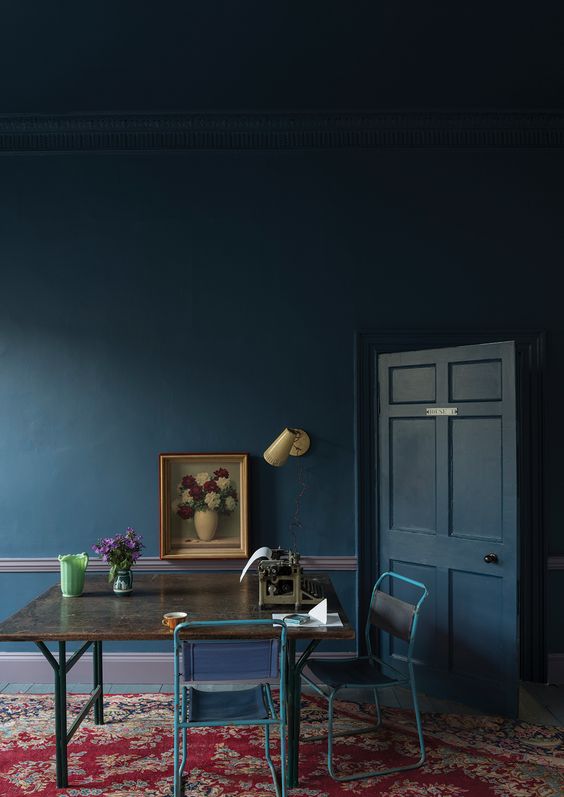
First of all, I love everything that you’ve done with your house and cabin. It’s so inspiring to see you modernize these old beauties while highlighting their vintage details. Which is why I gotta vote blue walls and white trim. The black read too modern, while the blue seemed modern but not too modern. I also though that it complemented the brass better than the black. And the white trim highlights your great old mill work. It seemed like that feature was lost in the tone on tone option. But I know that whatever you do will look amazing. Can’t wait to see the final result!
Thank you so much, Jenny! That’s super nice of you to say. Alright, I’ll put you down for team blue walls ;), that seems to be winning right now. I think the blue would look super beautiful with all the brass accents, and part of starting this whole progress was to call out that pretty brass railing on our stairs. At this point I am leaning blue (I think), but the tone-on-tone thing still has me all wut (????)! I think it would look super glam and kinda fancy, and I don’t know if that’s too chic for me – my daily uniform is still band t-shirts and blue jeans – but I might be growing up a bit. I just don’t know!
GURL, this looks so good. The colors, that west elm light fixture, and those swipey images. #nailedit
Lady friend, you should try out the sliders sometime, found ’em right here JUXTAPOSE. They are super easy to make, but they are a little wonky on the responsive side – not sooo much though that I didn’t use them.
I want to know what color team you on?
Here’s me weighing in ;) I have a soft spot for dark chocolate browns mixed with dark blues! So beautiful! I mean the black is nice too but the blue…….it just speaks to me! And for the trim, I’m on team tone-on-tone all the way! It will just make it so seamless and gorgeous and rich looking! That’s just my two cents. It’ll be pretty no matter what…….but definitely do dark blue tone-on-tone ;p
This blue is so pretty, and I’ve drooled over this shade for years, so I know I wouldn’t regret it IF that’s what we go for. You guys have me leaning that way though :)
Thanks for the tone-on-tone vote too, I am still super torn. I think it could look amazing, but it could also make the hallway very dark, but it might make it very awesome too. I dunno!
I realize that I should’e left some inspiration photos in this post. Here’s one more that is pretty great. My trim is no where as ornate and my hallway could def not fit a piano in it, but you get the idea.
One more thing, because I just can’t help myself. What about blue walls, black ceiling and doors, white trim?
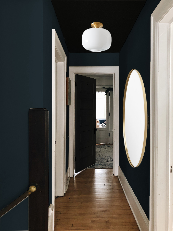
Oooooh. … I like that :)
Honey! EVERYTHING looks amazing! Truly!
I do have 1 question- what ever happened to that fiddle leaf fig that you pruned? I’m contemplating cutting mine off! There is lots of leggy growth but it doesn’t look good. What would happen if I just hacked it off and started over? My email is attached if you take pity on me! Thank you!!!
Thanks, Dena! I just responded to two of your comments on IG too, I hope those answers help with your FLF.
I’m team blue with tone trim. Immediately the toned photo caught my eye and I couldn’t stop staring. Also, very nice touch with the sliders ;) Makes reading far easier!
I am so torn. Today I’m feeling tone-on-tone more heavily. Maybe if I leave the ceiling white that will help to bounce light around the space, or it will just look really dumb. Not sure.
In brief:
black walls and ceiling, white trim, dark doors
maybe your doors in the blue? i know that doesn’t put the blue next to the brass.
i could probably go for the blue walls, but i didn’t dig them in the fourth photo down. mockups aren’t perfect for showing color, though, so go with your gut. you’re on a roll now!
Thanks for your feedback, I will go with that gut thing! I still haven’t put roller to wall just yet but I’ve thrown up a few test colors. Still undecided, but I think I’m leaning towards the blue.
Oooooh, love where you’re going with this! I vote white trim, bc the hallway’s so dark that I think you’d miss the detailing completely if it was painted to match the walls. Most of your tone on tone inspo pics are big, light-filled rooms. Anyway, I’d go light cuz you can always change your mind later, and it’s easy to paint dark over light than vice-versa!
I personally am #teamblue, because I never get sick of blue. I don’t think you need to match the entry color, and it actually makes sense in my head that another color higher up on the wall would be lighter.
Thanks for your comment, Lori! I am still torn, I think it could be good both ways. I like the drama of the tone-on-tone, but your concern is what concerns me too. The space is sooo small. If we stick with the white trim, then I think I will for sure paint the doors black, I think.
I feel like this shouldn’t be so hard, but it is! I’m just glad I figured out that it is possible for all three spaces to co-exist in the same space. That was the hard part!
Nice solution with the paint line to the wall downstairs.
I’ve got no opinion about the trim color, but wanted to say that I think the dark walls and leaving that corner protector by the stairwell dark is fabulous. Having been the mother of boys I know that the stairway is going to get banged up and dirty. Making it all dark and hiding the corner bump guard is perfect. I will say, keep a fingernail polish sized sample of your paint in an upstairs closet so you can touch up dings. That’s the one not so great thing about dark walls. Gouges show.
Thanks! These are great tips! Did you know they sell empty quart sized paint cans at the hardware store? I often move my paint-can-remnants to the quart-sized can and then keep paint on hand for touch ups too :)
It’s PERFECT!!! Definitely black and white trim. <3
Thanks for your vote! I am leaning nearly black blue right now, but I’m still undecided. That’s why you haven’t seen any updates. I’ll figure it out soon though, promise.
We have a plumbing access panel too, but luckily it is the same wood as the trim so I think it looks kinda cool. I vote for using the same color as the entryway and white trim. Love the contrast!
I’m definitely going to weigh my options to see if there isn’t a prettier way to incorporate the plumbing access panels. They are such an eye sore!
I’m reeeeal jealous of your brass handrail! I also Love your lighting choices. Regarding trim, sometimes I’ve seen good pics where people treat baseboards and window trim differently. like leave the window trim as wood toned but paint the baseboards white. I know you don’t have windows here, it’s doorways, but maybe if an all in or all out solution isn’t best, you could do some mixture of keeping the doorways painted white, but painting the baseboards same as the wall color.
Hey Katie! Great suggestions, and that’s one of the questions I’ve been asking myself. I feel like there is 3 different combinations of trim/wall/ceiling color that I’ve got bouncing around in my head and I haven’t been able to decide which is best. I know I’ll get there, sometimes I just have to stew on these things for a bit. Thanks for your suggestion!
I LOVE the blue. The shot of it with the light fixture hanging above the stairs really sold me! Also thanks for the inspo. My hubby and I just bought our first house in south Minny last fall and there is just. so. much. to. do. I’m really diggin the archives!
I love the blue and the black, but I think the blue would really highlight the brass. Yes, so much to do with these old houses. We’re trying to fix them up while at the same time incorporating our own aesthetic. There’s always a project, but that’s why I love it. Congrats on your new place!
Wow! Absolutely love this solution. I can’t get over the black in the hallway. Normally I love a tone on tone look but seeing those comparisons, white definitely gives you more light.
I’m sure it’ll look great either way!
I’m here to confuse you even more. :) I’d paint that ceiling so fast you’d blink an eye and it’d be done. If you don’t want to, look at real deal old school bead board as a cover or Anaglypta wallpaper. The wall paper would be good for your walls too. Your walls can be in terrible shape, or if you want to do the ceiling, screw up 1/8 dry wall and paper over it. You can remove it later when you deal with the popcorn. The wall paper was used in old homes and is just thick, embossed paper you can paint it any color you like. I love it and plan on using it in a bathroom. It’s good for hiding sore spots like those panels. I used it to hide an electrical panel in our Manhattan loft. Good luck! Have fun!