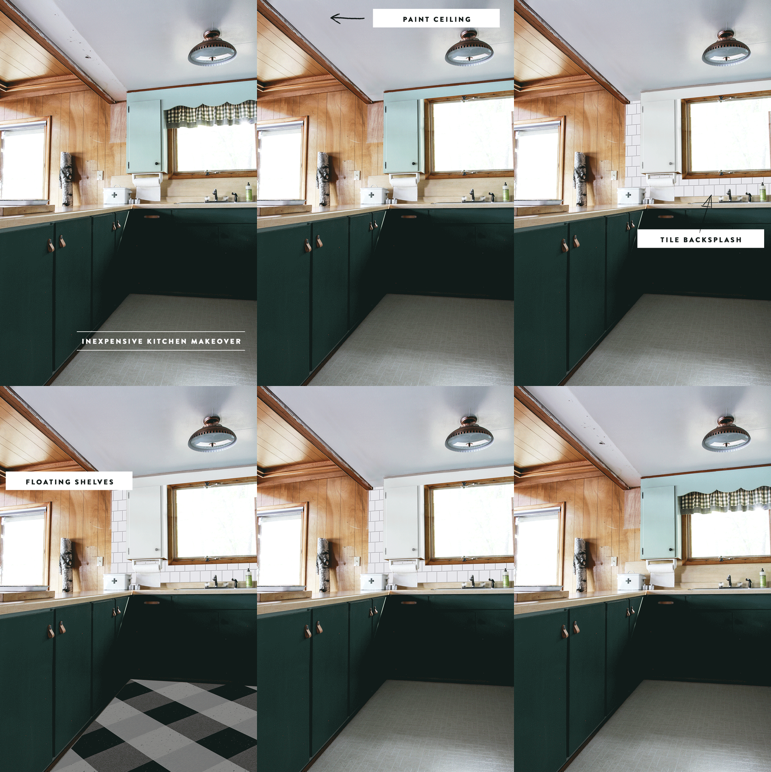
Hello people! I wanted to share with you a few ideas I’ve been knocking around for the cabin kitchen. A little background, the kitchen cabinets are currently painted a light sage green, and the cabin’s exterior is also green. Green is also my favorite color, so it seemed pretty natural to me to want to incorporate a bunch of green into the cabin design. For me, green is also a protest to all the red and black cabin decor that I am firmly not in to, because of it’s overuse and misuse. I’m taking a stance, I’m woke, I’m openly, and whole heartedly embracing the natural color of the woods!
Okay, so. The cabinets need a refresh. I started with taking down the upper cabinets that hung over the kitchen peninsula so that the main floor felt more open (see pic in this post). Plus, when yer cooking, you can look out at the lake instead of looking at old grungy cabinets hanging from the ceiling. Of course we had to compromise, giving up cabinet space – howevs, those cabinets have been empty since we moved in, so no biggie.
Removing the cabinets left a funny space on the side of the uppers, adding some open shelving here would help to balance the space and give the illusion that the tile goes all the way to the ceiling throughout the entire kitchen.
The other big recent change is new paint on the base cabinets. I wanted a dark muted green with blue undertones. I found it in Olive Tree by C+K. Next time we visit the cabin, I’ll be painting the uppers white and removing that ~~~~ trim above the window.
Unlike the gold mine we found on the main floor, there are no hardwoods hidden under the linoleum kitchen flooring. What’s a babe to do? I think it could be really cool to do a buffalo check style pattern using vinyl tile laid on a 45º angle. I know this plaid flooring is really trendy r n, and it might be a little bit too whimsical for the more mature and sophisticated cabin vibes I’ve already put together, but I think laid on a 45º angle it could elevate the overall feel. I am in no rush to lay new hardwood or tile, and I think this could be a good “in the meantime” solution. There is also tons of traffic in this area, the kitchen leads to the main floor hallway, front door, and bathroom. Having a cute durable flooring would not be a bad thing. Jesus Louise (that’s what Gus says now!), I need to take some more pictures the next time I’m there so you guys can actually see what I’m talking about! For now you’ll just have to use your imaginations.
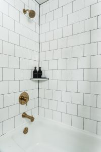
I feel like I’ve done so much tiling in this lifetime (now that I’m done with the basement bath), that I’m pretty sure I could whip this backsplash out in a matter of minutes. Not seriously though, I could probably do it in a day and it would be cheap and look way better. We’d leave the counter tops for now, because they are just okay – they are a light wood grain formica, and they look alright.
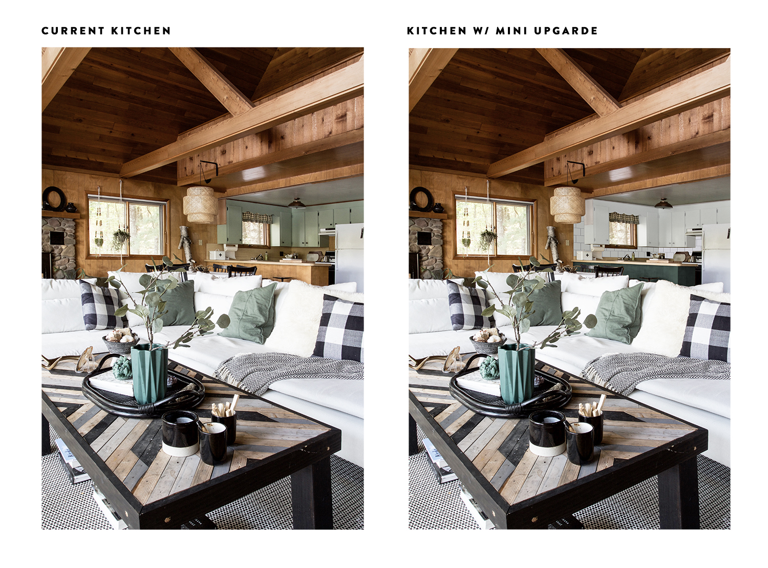
So what do you guys think? Am I on the right track. I’m including some inspo photos from other cool kitchens as well as a view from our living room looking into the kitchen so you can get a feel for how this will all look together.
I promise I’ll take more photos next time!
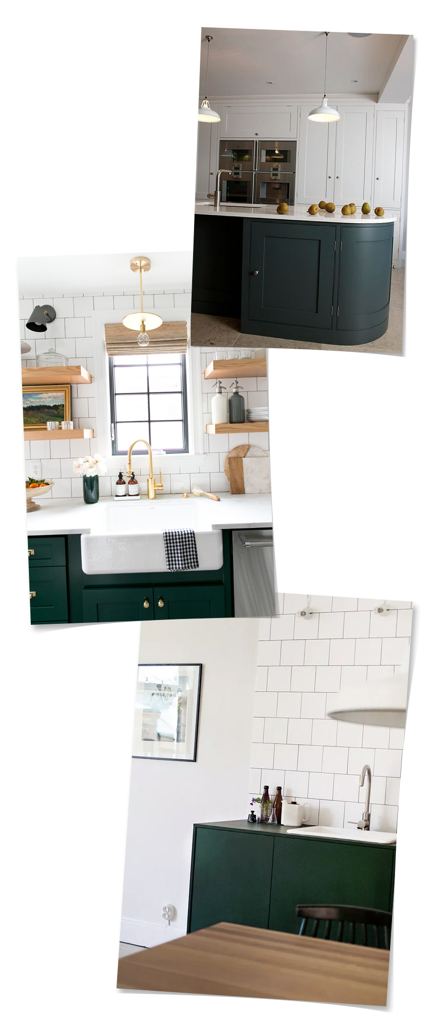


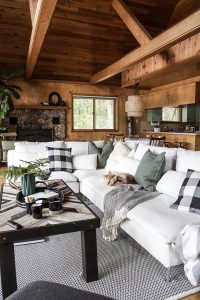
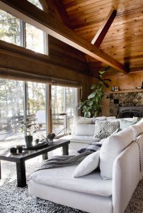



I looooove this idea & your inspiration photos are fab!
Thanks! I’m glad it’s being well received!
Do the vinyl floor! Easy upkeep and that’s what cabin life is all about! I am lucky enough to have heated cement floors that are amazing year round.
Ooh heated cement floors sound nice. I think the vinyl will be a pretty good compromise. I always have liked those flaked vinyl tiles.
All the heart eye emojis!
Thanks, Anna!
From your pics of Current Kitchen and Kitchen w/Mini Upgrade it’s hard to tell if it’s feasible, but have you considered taking down both right and left uppers that flank the window above the sink? And extend your ideas for floating shelves for both sides of the sink. The inside corner of the uppers to the right of the sink may be tricky, but that window is awesome and the cabinets, well, not so much. BTW, your work is amazing!
UI totally agree on tryiong to remove the cabs on either side of the window and do open shelving right there. It would open it up a lot. Just stick all your plates, bowls , and cups there. I have open shelving uppers and though I cook a lot I also use everything enough that nothing gets stick/greasy.
I’m on board! I think we’ll get to the open shelving phase eventually! I think it would look so awesome!
Hey Paula, I know my photos are horrible. When I’m at the cabin I always snap a few, but they are never intended for a specific post so I don’t always have the right photos to share – got to work on that! Anyways, yes. I am with you on this open shelving plan. I totally screwed up, I should have mentioned that this plan is a two phase process.
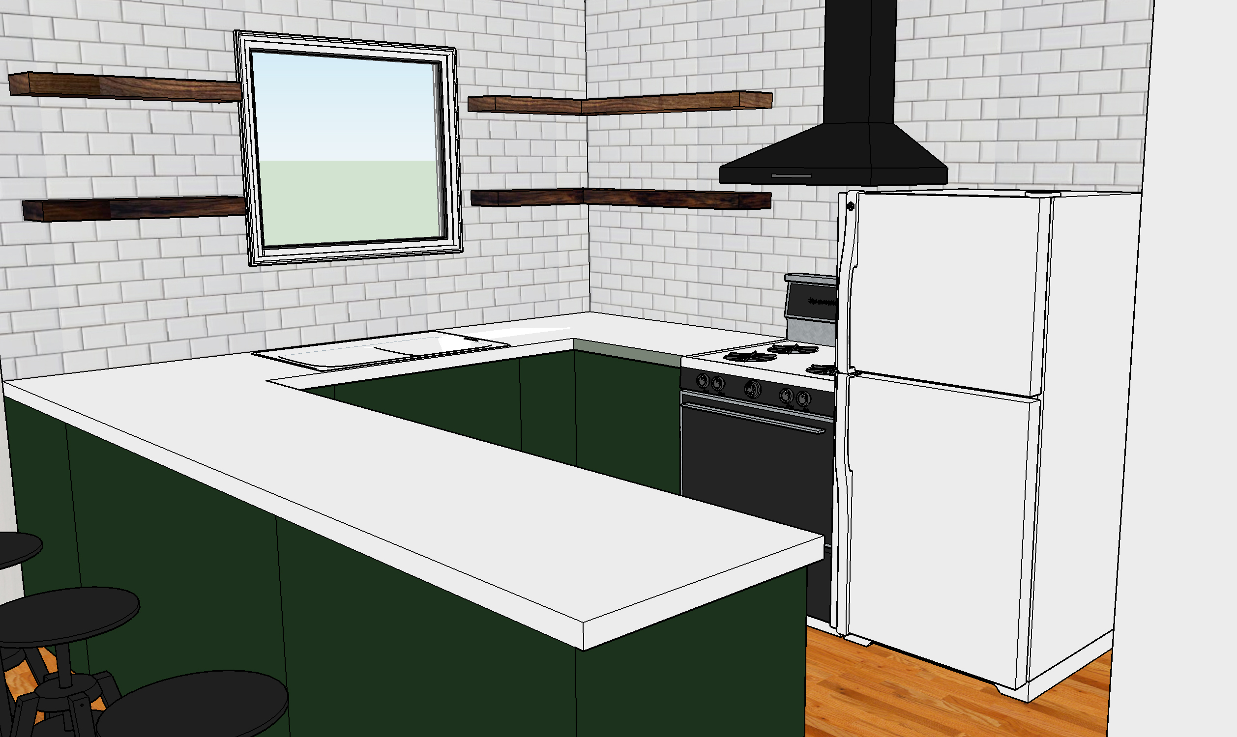
The first phase is outlined above. The second phase would include removing the upper cabinets, tiling the entire backsplash, adding floating shelves, adding a vent hood over the stove, and replacing the sink and countertop. Obviously, that’s the more expensive phase, so for now we paint!
Here’s a pic of what I was thinking, sounds like we were thinking the same thing!
Now, THAT’s a helluva plan! You do rock!
Yep. Spot on!!! V. Nice.
Thanks, Lady!
Hey do I see a green glossy ceiling in the make- over pic. ? I love the dark green cabinets.good choice.
I suppose it does look that way because of the light, but it will probably just be a boring flat white ceiling. I wish I could insert the tongue sticking out emoji with one eye closed, cause that pretty much sums up how I feel right now.
1. who gives a damn about trends. that floor would be an adorable solution to a problem. f the haters right?
2. that cabinet color is so perfect. i want to hold it & stroke its hair.
3. the leather pulls just complete it perfectly.
4. i feel your window trim pain. cutting mine off was extremely satisfying. people don’t still do this to their windows right?
You gotta go with the buffalo check vinyl! Or, at least a classic checkerboard. This is the perfect opportunity to do it and it cannot be wasted, Alison. Trendiness be damned!
I love all of this. ALL OF IT. But I particularly am in love with how the amazing kitchen floor will tie in with the throw pillows. Good job, lady.
Love! I literally just chose square backsplash tiles for my home kitchen reno earlier this week- great minds! That green color is so perfect for the lowers too. I say if you like the floor, go for it. I totally get your hesitation with the cabin-y look but if you hate it, you can peel it up right? :)
I love the idea of a buffalo check floor matching your couch throws!