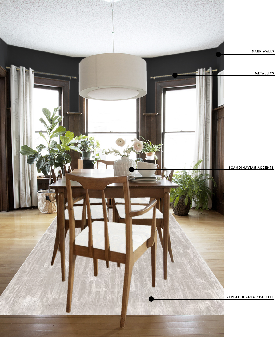
I’m back to my seasonal need to tweak everything inside the house. This happens every fall, it’s that whole nesting thing. Our time outdoors is limited, daylight is waning, and we begin to nestle into our winter ways (I’m so damn poetic today). We spend a lot more time in the living room, even eating meals at the dining room table (novel huh?). It’s nearly impossible for my mind not to wander when it comes to re-decorating these spaces.
The dining room has never been a space that I’ve felt overly confident or proud of. I’ve had to really suss out inspiration and blindly find a cohesive design from the jump. Pins for dining rooms featuring dark wood paneled walls, built-in buffets (done in a style that appears to be a mashup of craftsman and late victorian eras), and mid-century modern furniture are few in far between.
I’ve realized over the years that if I’m going to embrace this wood trim on our main floor that I need to go dark with the wall color, seriously, it seems to be what works the best. Believe me, I’ve tried everything. I would love for it all to be white, but it always seems forced. Dark walls just seem right in the space. Plus going dark has the added benny of being v cozy in the winter time.
My main concern is that dark walls paired with lots of paneling and woodwork tend to feel a bit more refined and grown up, both things are not really words you would use to describe me or my style. Herein lies the problem, figuring out how to put my personal chill into these adult rooms.
We’ve really embraced white walls and a much more Scandinavian-inspired-cabin-style in the rest of the home and it seems to work really well in this old house. I still hang on to a few mid-century pieces that I love, a lot of black and white textures (especially with throws and pillows) and a high repetition of brass and copper metallic accents. I also reiterate dark blues everywhere (if you haven’t noticed) and sprinkle in some blush tones now and again. Our bedroom for example is really comfortable, light and airy, and the copper peonies wallpaper does a good job of making it more mature. It’s heavier on the scandinavian and light on the grown up. I think I need to reverse the ratios for the living and dining room so they feel like the more casual areas of our home, but just opposite. More refined and moody, with a heavy hand when it comes to dark cool tones and blush colors, sprinkle in hints of graphic pattern, metallics, and then add lots of little references to Scandinavian sensibility in the accessories. Does that make sense?
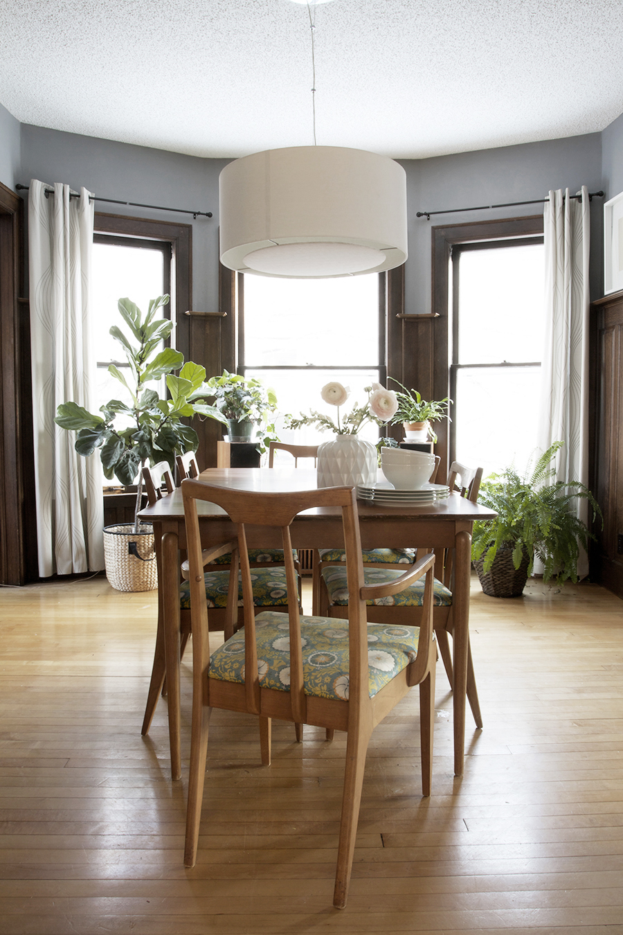
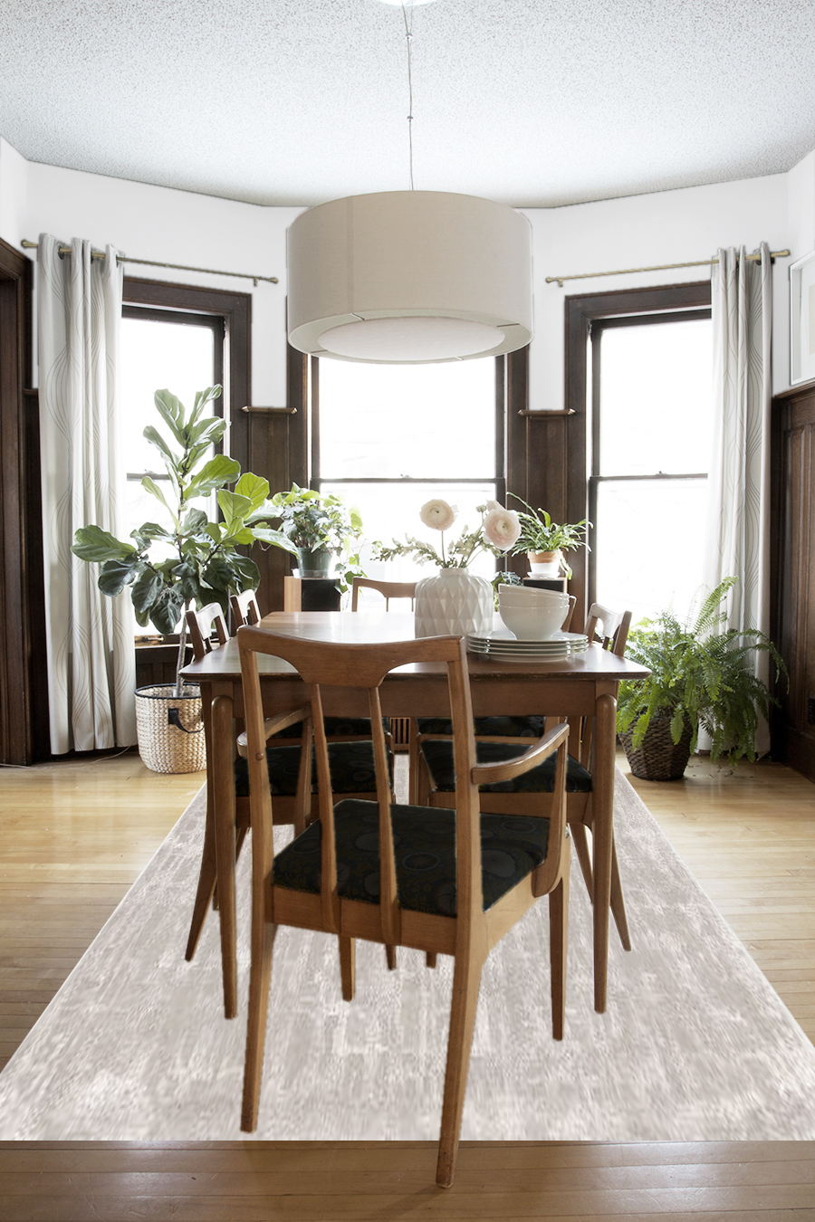
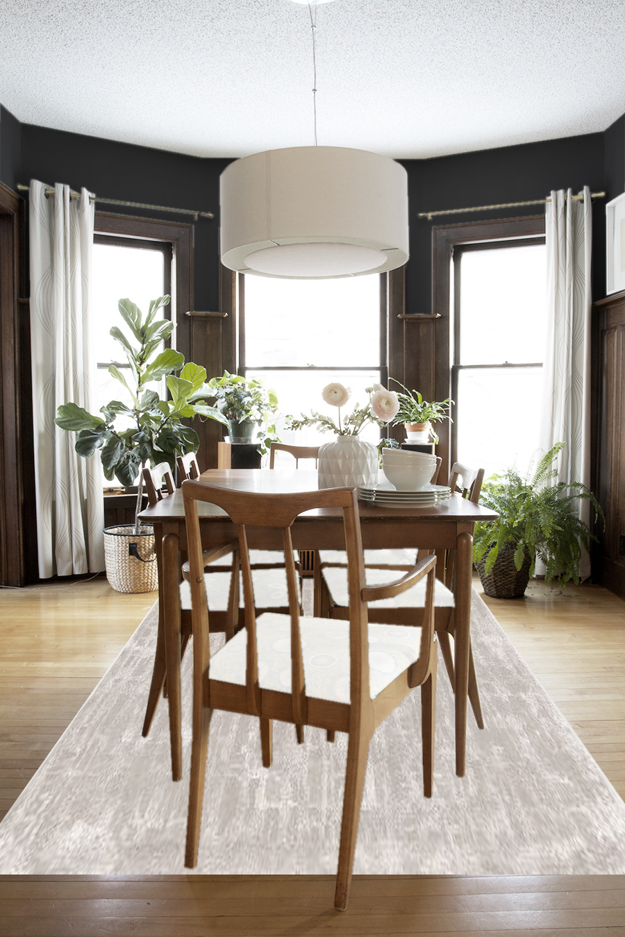
Do you guys see what I’m saying? It’s just fine in its current state, but it’s not as cohesive with the rest of the house. I think I’m ready to be over the green and blue floral print I upholstered the dining room chairs in. I love white walls in general, and the grey walls are nice and play well with the dark teal in the living room, but it just doesn’t have the same feel as a deep dark color like black does in this space. I love what a blush rug might do to anchor the dining room as well — it’s probably something that would have to wait, but I really like the idea of it. I think I’m on the right track, but this whole house has been a design mystery for me since day one, revealing little clues along the way. While I wait for my bathroom supplies to be delivered I’ll keep thinking about this space and maybe I can start to incorporate some of these new ideas sooner than later.
I am a fall dreamer.






I totally see what you mean there with the dark walls. Our house looks very similar to yours and we’ve focused a lot on greys and lighter colors. I’ve been so afraid to use dark colors fearing that it will make the house look too dark with all of the wood! But, you’re definitely making me reconsider that fear. I love the dark color and it really helps the wood pop from the walls in an elegant way. I think you’re on the right track there!
What program did you use to try out the different wall colors in your photos above? The dark walls look amazing!
I used photoshop to enhance the wall color, change out the cushions and add the rug. It’s a great tool, but I know it can be spendy and tricky to use.
I think part of the trick to it is accenting the dark with a lot of white. White frames, white vessels and decorative objects, white pillows. It needs contrast to work, but I think it could be what all of us dark woodwork suffers could benefit from!
I really enjoyed reading about your thought process when you approach redecorating a room. I agree the dark walls will look great, and the addition of the lighter pieces (rug and chair cushions) will keep it from being too moody and formal. I love your addition of metallics, something I’ve always been afraid of doing, but have now started to because I see how much they add to a room. Thanks!
Hey, Thanks Ana! I’m glad talking about this process stuff isn’t too boring. I always like to know about other peoples thought process – I wish there was more of it! I credit my love of metallics to Emily Henderson, I took a leap after reading her “styled” book last fall and purchased brass rods for the living room, and I really love them. Now I’ve hints of brass everywhere. So we can both thank her :)
I really love the dark wall color… it makes everything else pop!
I agree! Especially because we have white frames on the other three walls, and new white linen curtains would help too (dreams…).
I think Scandinavian *is* grown-up.
How will this look with the built-in hutch? Will you change the inside backing to white or something else? The black does look great with the wood and the windows.
I love the idea of a rug under the table, but my kids are hobos. Also, we have only a single dining table, so it has to work as the One Table for food, crafting, painting, play-dough, cub scouts, etc. Again, I don’t think there’s a rug that can hold up to that kind of abuse.
Hey Stacey, You’re right, Scandinavian is grown up, but often comfortable. To describe what I’m trying to get at more clearly, I want my space to still feel youthful, casual, playful, simple and comfortable (ala Scandinavian design), and not be too stuffy (like my Grandma’s house). Does that make more sense. Thanks for setting me straight ;)
I know, I worry about my kids and a future rug too. They are finally getting to the age where not everything falls on the floor, but still, it does. We mostly eat at our kitchen table, so it wouldn’t be getting as much every-day-wear as yours might. I do worry about that though!
Also, there would be scotch guard involved.
I LOVE the dark walls option! So, just a thought that came to mind… After seeing the things you were loving at Target, it reminded me of this recent project over on Wit and Delight – where she did the check pattern with FLOR tiles – I know it’s a bit “on trend” right now (neither good or bad, just is), but I could totally see that being a fun Fall/Winter option, great contrast for the dark walls, a bit of a graphic look to keep with your Scandi style (LOVE)… So, had to share :)
Here’s the links I found – it’s the one she calls the Smart Tartan look:
https://www.instagram.com/p/BK4JWMnDtpS/
http://witanddelight.com/2016/10/my-new-hobby-making-creative-custom-flooring-with-flor-squares/
Hey Shawna! Yes! I saw that post too and I was thinking I might use the tiles in my entry, that might work well for cleaning up dirt and messes and such. Anyways, her tile designs were rad. Thanks for sharing all the links!
Yes! You’re definitely on the right track, most people don’t spend much time in their dining rooms- I think it’s a perfect place to go dark or busy with a wallpaper. :)
I love this room. The colors are rich and clean. Is that charcoal on the walls? Do you have the paint name?