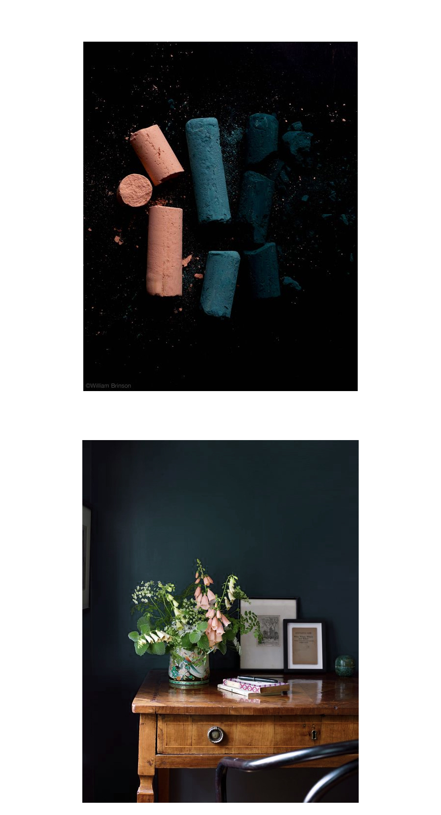
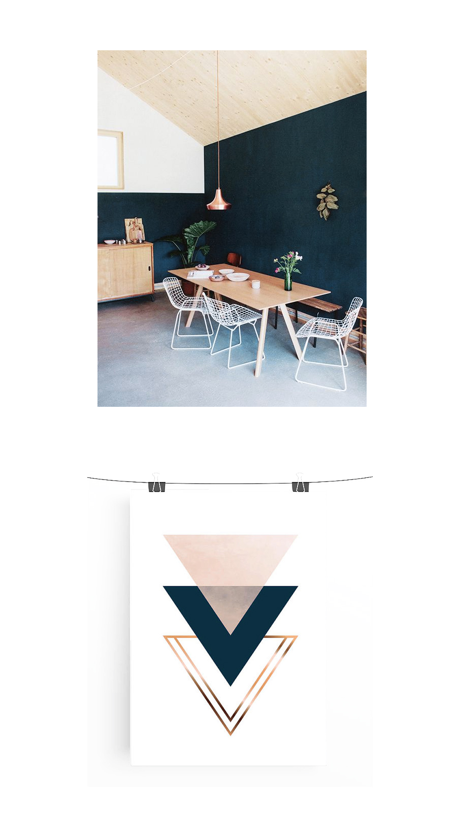
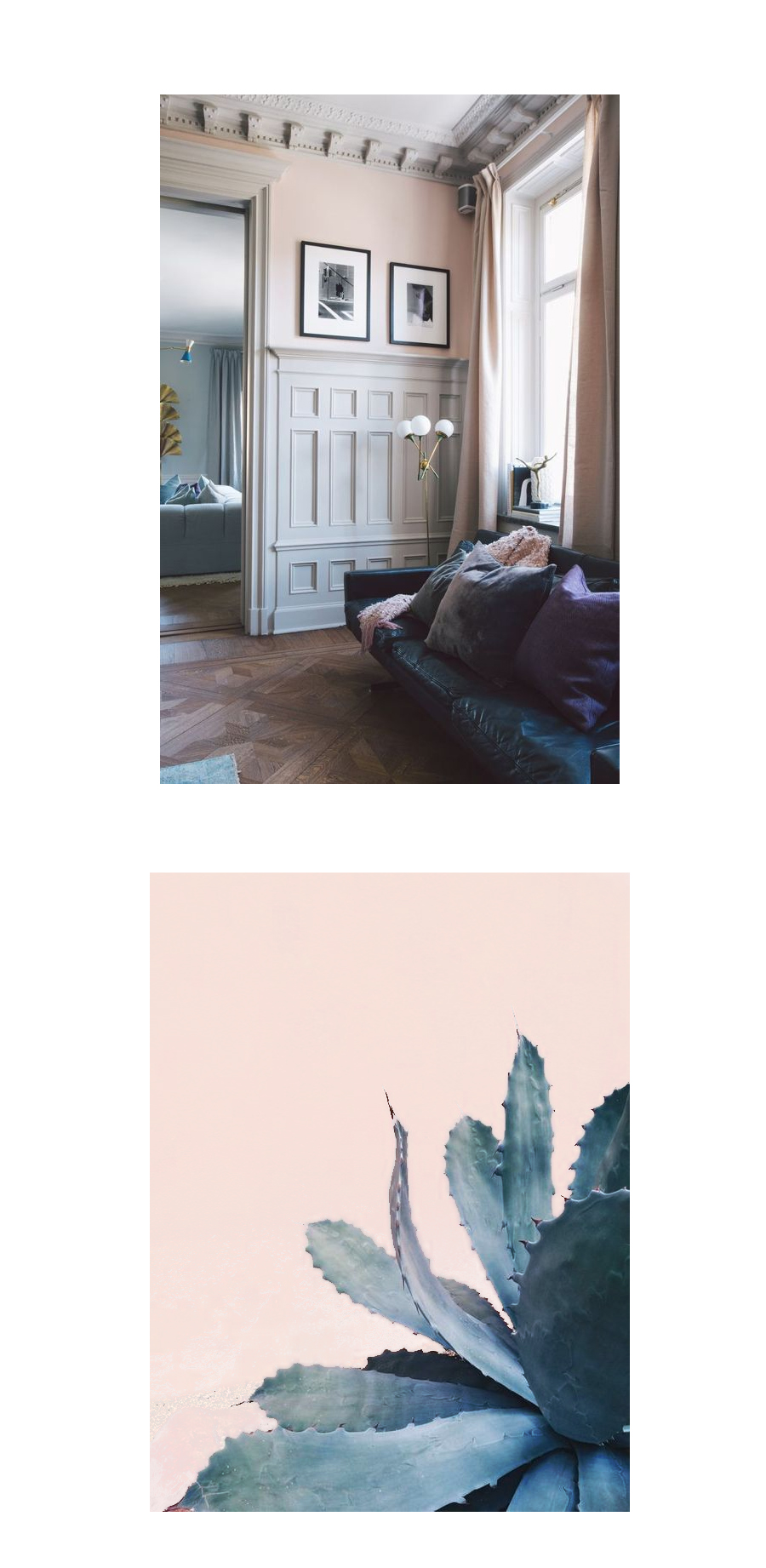
I think I’ve been obsessed with blues and pinks for three or four years now. As time goes on the blues become darker and more dynamic and the pinks more less saturated and more muted with yellow undertones. It kills me, like seriously, I kinda feel weak in the knees when I look at some of these images. I’ve been noticing the change in my pinterest boards too, I nearly pin every image I come across with references to this ultimate palette.
I’ve been thinking the living room needs to surrender and give into my absolute need for a darker hue. As it sits, it’s a dark teal and it plays nicely with our dark wood moldings, but I think I’d love it even more if I could push it a shade darker, skimping on the green and upping the blue slightly. Probably worth the gallon of paint and the couple hours of work, don’t you think?







Do it! But how will you bring in the muted pink?
Mary! I think in pillows and artwork. Plus there’s pink in the entryway now, which is just adjacent to our living room.
I really love the second picture! I’d love to see you translate these inspiration boards into a design for your living room.
I do too! We’ll start with darkening up that paint color and see where it takes us ;)
Totally feeling these colors, too!
My living room is close to the navy blue you’re describing. Left to my own devices, I probably would have gone even darker, but my husband lobbied for the lighter blue, and I love it. You can see it here, featuring giant vintage blush pink lockers I found a couple of years ago, and partially based the room around: http://diyinpdx.com/2014/09/30/front-room-tour/ It’s Van Deusen blue, by Benjamin Moore. Your current living room color is lovely, though, and painting is a pain in the butt!
Literally right before I read this post, I just finished reading an article about why Millennial women love this shade of pink. I am loathe to consider myself a Millennial, but I do appreciate that pink, too! http://nymag.com/thecut/2016/07/non-pink-pink-color-trend-fashion-design.html
Yes! Go dark blue. I have a 1924 craftsman over in SLP with similar wood trim and painted my living room Benjamin Moore’s Hale Navy. It’s so good! Now if only I had the cojones to bring in a pink couch…
I do, I have the cojones, just not the cash. Oh man, how great would that be? I’ll check out the Hale Navy, I was also considering Hauge Blue from Farrow & Ball. It needs to have a bit of yellow to compliment the red undertones in the wood work, but it doesn’t need to be green or anything. Thanks for the tip!