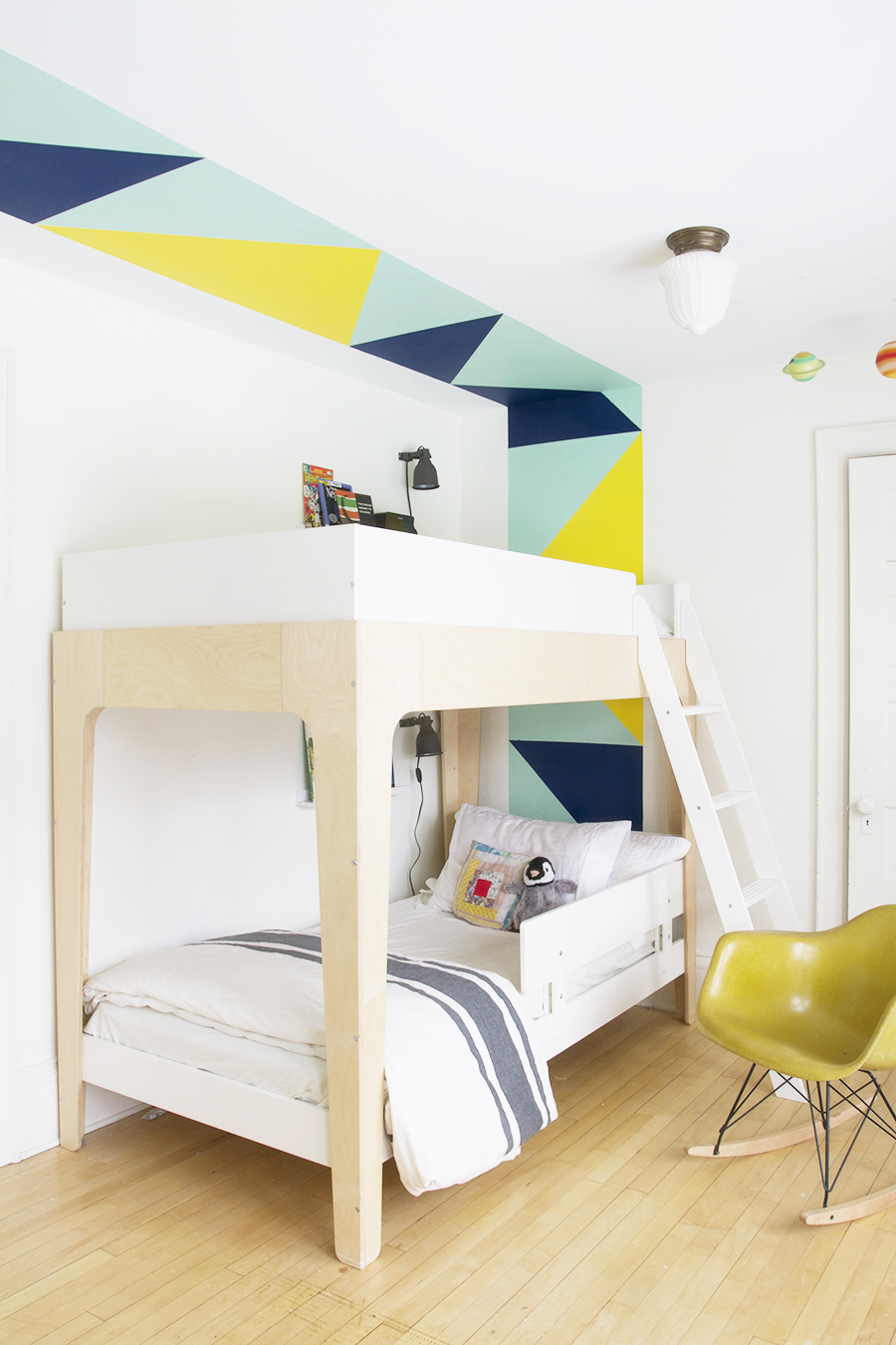
Five years ago this month we moved into this house. The entire place was painted in a terrifyingly boring light brownish-yellowish color that was well past its prime, if there ever was any sort of prime for that brand of mediocrity. Bottom line: everything needed a fresh coat of paint. The first thing we did when we moved – like literally, before we unpacked a single bag – was tackle the bedroom of our then-20-month-old son, Finn. We painted his room a bright yellowy-green. There was no plan for this color, no design, no motive, no NOTHING, beyond our satisfaction that it was 100% not the bland death that existed before. The little baby that moved into that room 5 years ago is now nearly 7 and has a younger brother he now shares his bedroom with. Things have changed.
After we slapped that green paint up on the walls we didn’t gave it another thought for quite some time. Even 2 falls ago when the boys combined rooms and started sharing a bedroom, updating the paint color was the last thing on my to-do list. Fast forward to now, spring 2015 and I’m ready for a project. Lucky for me, my pals over at Ace gave me the inspiration to finally tackle those green walls and make this bedroom a space that is fun and happy for my boys.
You guys might not know it, but something really great happens in March. I know what you’re thinking, but no, it’s not the first day of spring, the snow melting, the sunshine, the college guys throwing the round orange sports ball at the netted circle… none of that. It’s actually the month of 31 Days of Color over at ThePaintStudio.com. For seriousness though, if you’re looking for color inspiration, that place is oozing it. All of us Ace bloggers are contributing by doing something special with a different Clark+Kensington color every day – so hop on over and see what some of my blogger pals are up to.
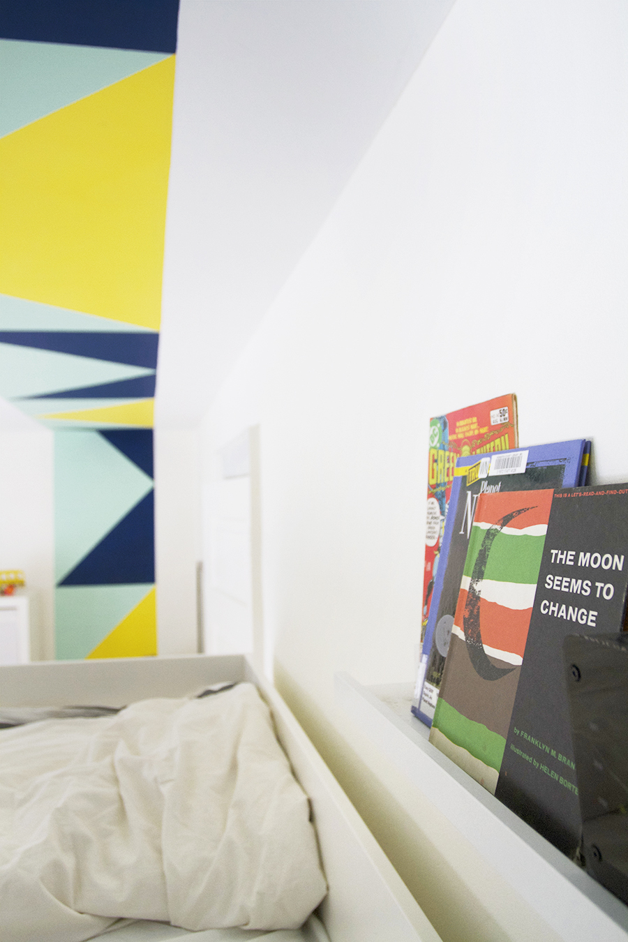
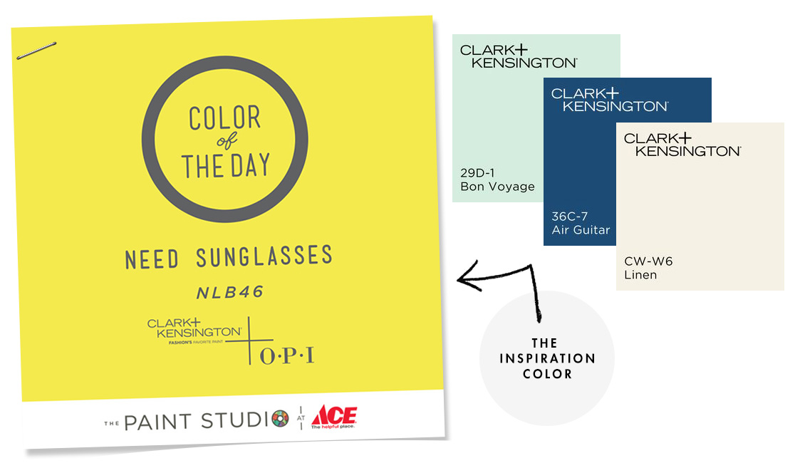
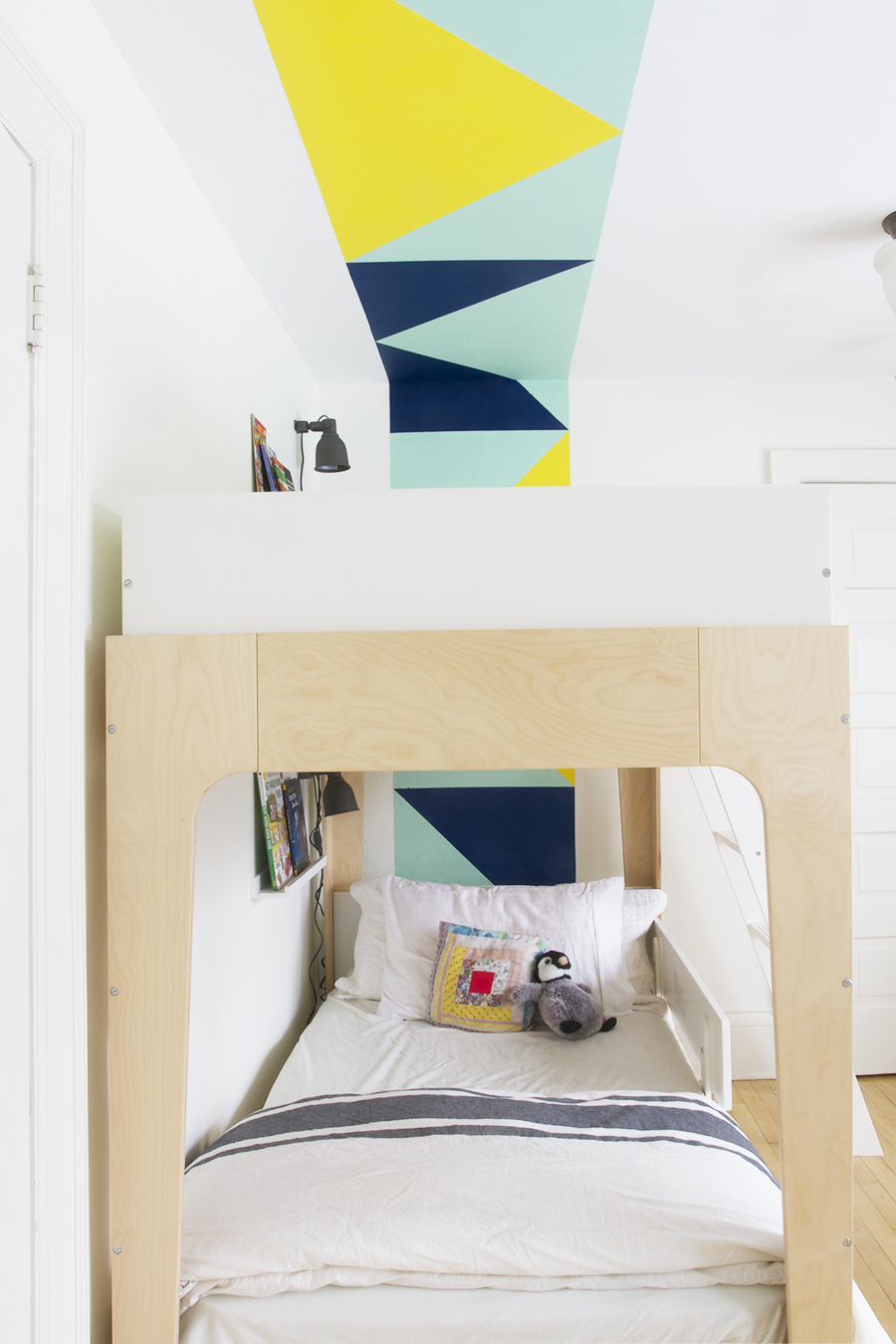
I actually choose this bright, bright yellow OPI Color by Clark+Kensington color called ‘Need Sunglasses?’ It’s a super intense yellow, yes, but I wanted something that was bright, happy, fun and most importantly was a color the boys both actually liked. This bright yellow had to be an accent color in this space because it would’ve been too much to add that loud of a color to all four walls. It’s bright and intense, but it’s not scary – it’s perfect for pairing with cool-toned colors to create a fun and youthful vibe. We decided adding a geometric pattern to the walls and ceiling would be pretty cool, some sort of cool genius even planned it so that it would flank the bunk beds just perfectly.
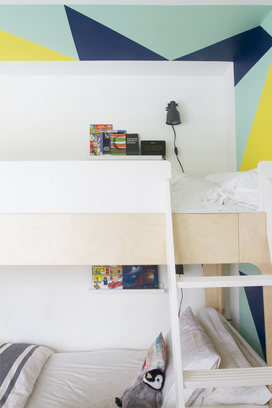
By the way guys, I painted these walls white first. I know everyone on the internetz is in search of the perfect white, and guess what you don’t have to look anymore, I think I’ve found it – I really like this one. I actually picked it really willy-nilly-like, and I lucked out. This is ‘Linen’ by Clark+Kensington and it is tyte. It errs on the warmer side and is just off-white enough to really set off crisp white trim and baseboards. It’ll be my go-to the next time I have the urge to paint something white.
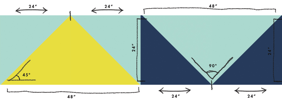
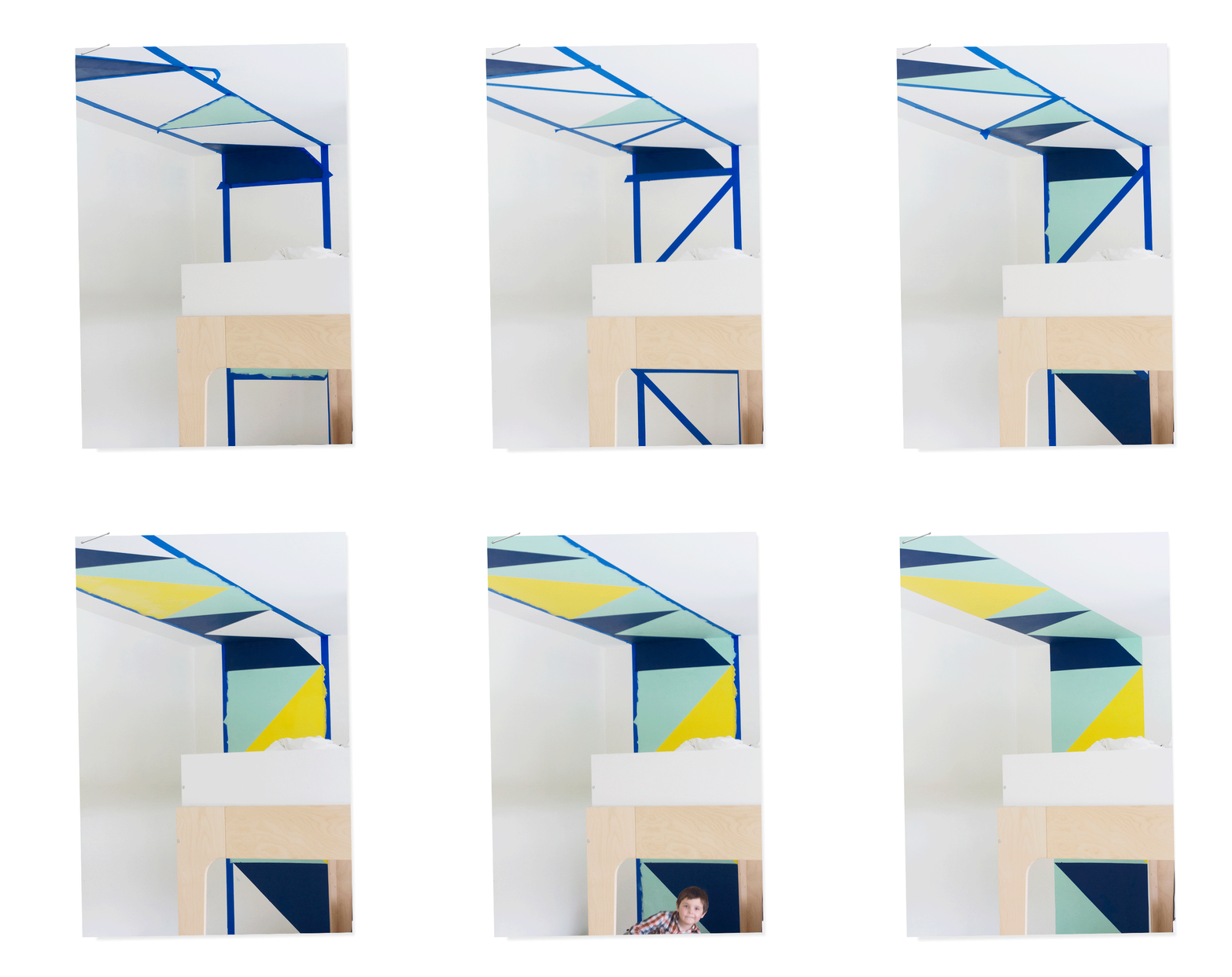
After starting with a clean white slate I was able to throw up this colorful pattern on a Sunday afternoon and even had time to take a sandwich and beer break. Before I began mapping out the pattern and masking and painting, I took extra care to make sure that everything was level, square and plumb before I began. The first step was to outline the entire length of the pattern by dropping a chalk line. From there on, it was pretty straightforward and easy. I marked down the chalk line every 24″ and then started connecting the marks with a pencil and a ruler. See below for the measurements. Next I taped off sections using painters tape. This project required me painting in four different sections, and took 2-3 coats for every section (3 for the dark blue). All-in-all I was done in about 7 hours including snack break.
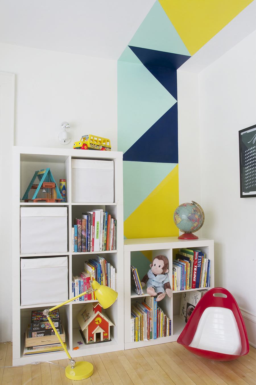
Not gonna lie, this color is bright but I really like it. I took the color palette of the entire house into consideration before moving ahead with this project. I wanted it to fit in with the vibe of the rest of the house while still feeling like a really cool boys’ bedroom. As recently as a few years ago yellow was a color found throughout accents in our entire house; it was a common thread and pulled everything together. Today you can find all those yellow accessories segregated in “the yellow room” – our spare bedroom. It just happens to contain a lot of items that aren’t as special to me as some of the newer decor we’ve brought into the house. It all really works in the yellow room though. Point is, there is yellow in our house. There is also blue, lots of blue and shades of turquoise. See, it all makes sense! I swear.
So guess what? Not only did Ace help me out with this project, but there’s a chance you could have them help you with a project too! Here’s the deal. If you’re interested in a color (today’s color or any of the other remaining days’ colors) Ace will be giving away free samples of the Color of the Day to the first 1,000 online entrants at ThePaintStudio.com. Here’s the big one though – enter the 31 Days of Color Sweepstakes daily for a chance to win a $10,000 paint makeover as well as daily $50 gift cards. I can’t even begin to imagine what a $10,000 paint makeover even looks like. If you win, you have to tell me.




Wow, that’s so cool! Love it.
Thanks, Sage!
This is so good, Scoops!
Elsa’s room was my inspiration!
That’s a Mom like right there.
Yeah! I love a solid “mom like”!
Love it! What a fantastic, fun room!
Thanks, Elise!
Super duper cool! Those are some very lucky boys. And I love how you presented the project in this post. Stellar work, per usual.
Hey Dana! I love your boys room too – they are also some lucky dudes – someday I might have to add some privacy curtains like you have done.
You knocked this out of the park! What an incredible project! I adore that geometric accent stripe and the colors are fantastic together! Incredible!
Thanks Brynne! I was kind of scared when I was told my color-of-the-month was ‘Need Sunglasses?’, but after stewing on it for a few days, I was able to find a few cool colors to compliment the bright yellow. I really love it now, I think the yellow is perfect for the kids.