Hey, guys! Here we are for the 3rd installment of the four year recap! I bet you’re so totally excited, right?
Four years ago we moved into our house – that’s a long time – the purpose of me sharing these photos with you is to illustrate a few thoughts about “home”. For us, “home” is not something that happens in the blink of an eye, and it’s not something that you need piles of money to achieve. Things happen slowly, very slowly, but if you are deliberate in your plans, eventually it will all start to come together. After four years we are finally feeling settled in this home of ours, and although I always have projects on my to-do list, it is finally in a state that I always hoped it would be when we moved in four years ago.
The photos today are to illustrate the process of our transitions. None of the rooms have undergone major renovations and I think that is just fine! Do you need a major renovation to make a house a home? No way, man! Yes, sometimes a coat of paint, a little design, and a lot of personality is all it takes. For me, it’s also important to maintain and give honor to the character of our home. Major renovations aren’t ever going to big for us (although we do have 1 planned for the basement).
The photos I’m sharing with you today are meant to be examples of the layers that go into making a house a home. I believe “home” should be fluid, and should have the ability to change with your life and lifestyle. Sometimes these transitions take a little planning and creative thinking, but that’s all part of the fun. Plus, there will always something to fix, maintain, and restore in in an old home, I happen to love these challenges.
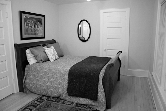
Above I’m sharing with you the boys’ room before we moved in. It was being used as a guest bedroom by the previous owner – the oversized bed made it feel tiny, I think the picture above illustrates that.
*You may have noticed that my before photos are all so yellow, the entire house was covered in light brownish-yellow paint, almost every single room. I took all the photos in the evening with the lights on which makes them even more yellow. The yellow is so glaring that I made two versions of the photos, the black and white you see first, and if you rollover the b&w photo you will see the room in full yellowy color.
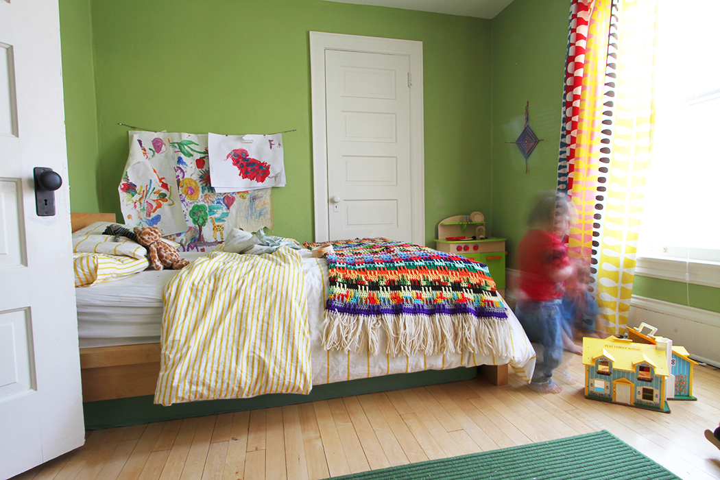
After moving in this became Finn’s room. We had a nursery set up for him in our previous rental house, so it was pretty easy to plop his crib and other furniture pieces into the room. We painted it orange, (major woof) and then settled on this “Asparagus” color. It wasn’t until we got more settled that we organized the space to make it functional, added the big kid bed (seen above) and decorated the walls a bit. We used his artwork as wall decoration, on another wall we added shelving for books (you can see the whole room here) and used dress-up hats and masks as art on his wall.
There has always the good old Ikea Expedit shelves (RIP) to come and save the day. Thankfully the Expedit will be replaced with the newer more environmentally friendly Kallax, but the Expedit has been so good to us when it comes to kid storage.
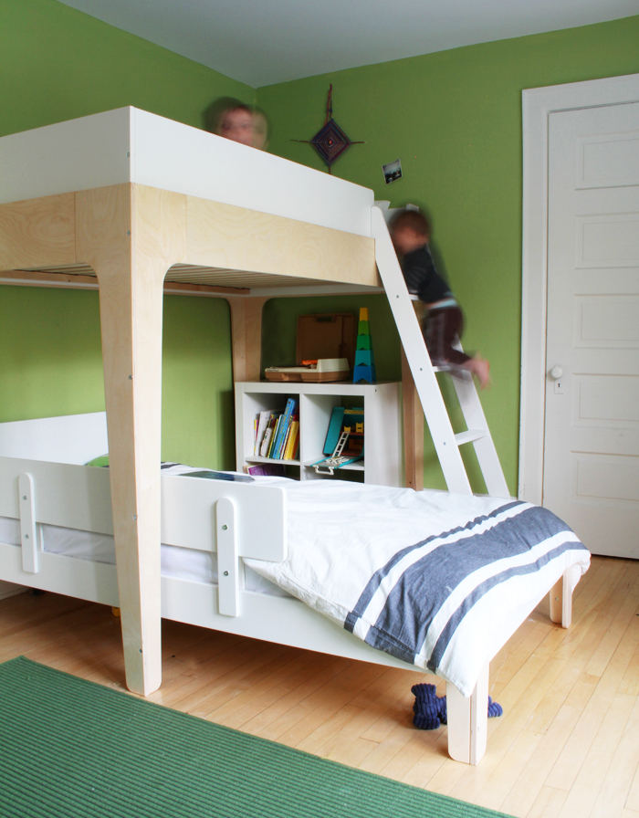
Fast forward to this year when Finn’s room became “The Boys’ Room”. Finn and Gus started bunking together! We splurged and bought the Perch bunk bed from Oeuf. We had a Oeuf sparrow crib for the kids and loved it, so we were already confident in the quality of Oeuf products. The Perch bed was worth it for us because eventually we can split up the pieces. Gus’ old room is pretty tiny, so when the time comes for him to move back into his room, the elevated bunk bed will come in handy.
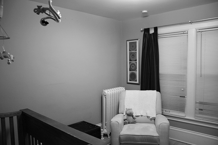
Onward, this is Gus’ Room (now the guest room) before we moved in. It’s not very big, as you can see – apprx 11′ x 11′. It does have a large closet which has been helpful – we store an extra dresser in there. We didn’t have a Gus when we moved in, but always supposed that we would eventually. We let the room sit as storage with the door always closed until Gus showed up in 2011.

We tried to make this small space as functional as possible when it transitioned into a nursery. It is by far the brightest room in the house, which is fantastic for us, but bad for babies who like to nap. We added black-out curtains that I made for Gus. Expedit came to the rescue again with the 5 square shelving unit, which we tucked in under the window. It works so nicely as a faux built-in-bench with storage underneath. I mentioned that we had an extra dresser in the closet, and then also had one in his room. We bought all of his furnishings in bits and pieces, as the budget allowed. Best of all, the use of small storage and clever seating made the room seem normal sized.
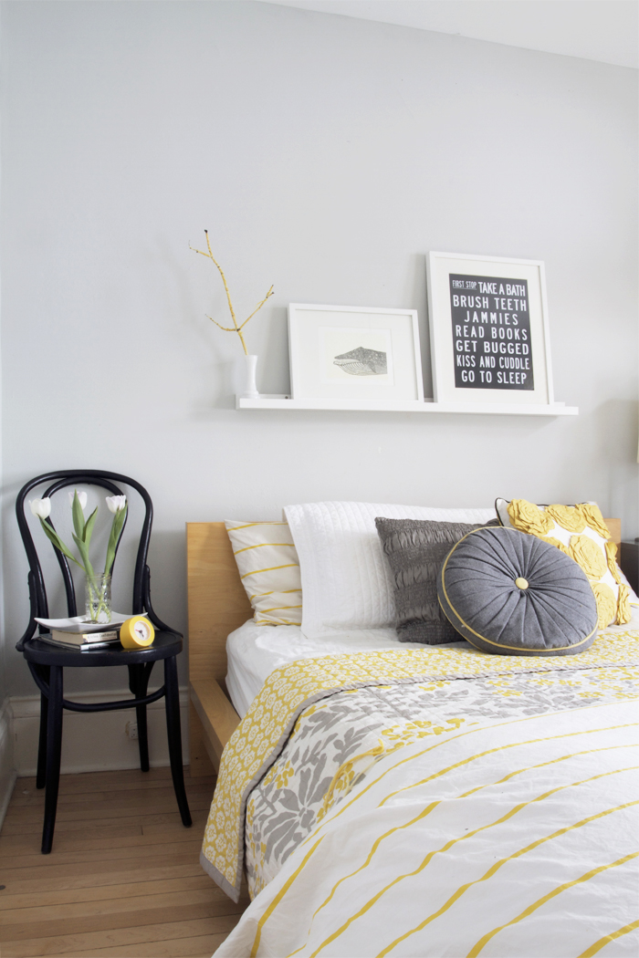
Now Gus’ room is the guest room. We haven’t had any guests make use of it yet, but has actually become very useful over the winter. With someone always being sick, this has become the quarantine room, for real. So sad, I know.
As you can see, so much of the room is the same, the grey walls and the curtains remain, and Finn’s old bed was added to the space. I pulled it all together with grey and yellow accents. You can get all the details on that transition over here.
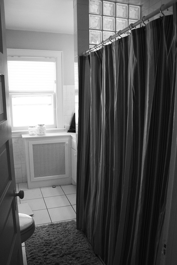
The bathroom before decked out with glass block tile and faux-marble printed tile.
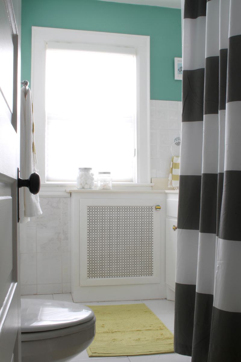
I’ve barely touched on the bathroom – that’s because we haven’t done too much to it. I painted the walls and added navy and yellow accents (a popular theme on the 2nd floor). There has been no need to do more than this because someday we do plan on renovating. I know I just said no major renovations, but there is nothing original about this bathroom, it was “updated” sometime in the last 20 years. We plan on renovating the basement next year and adding a full bath in the process. Once the basement is done, the next project will most likely be this bathroom. So it’ll be awhile…
Stay tuned for more of the recap!




I love it all! The bedding in all the rooms just looks so soft and comfy. And I love the bathroom with the mint, yellow, and gray. It’s perfect!
Thanks, Caroline!
I love the grays + yellows + turquoises. So pretty! Even little changes make a huge difference.
It’s true! Little things do make all the differend ;)
I absolutely adore your guest room!! So charming with that awesome chair and the clean lines of the headboard. Love the color scheme! :)
Thanks, Christina!
Love the sign in the guest room!
Thanks, Debbie!