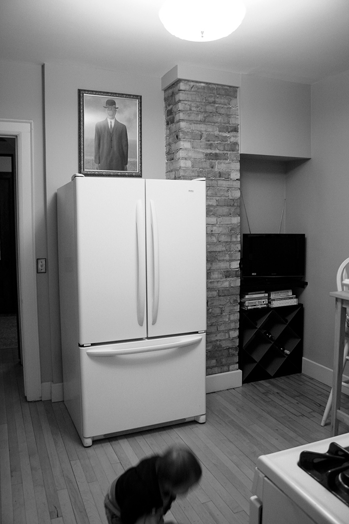
Okay guys, welcome to the second installment of the four year recap. I wanted to share with you guys some of the changes we’ve made since moving in. I am a sucker for ‘Before & Afters’ and though maybe you guys would be too :)
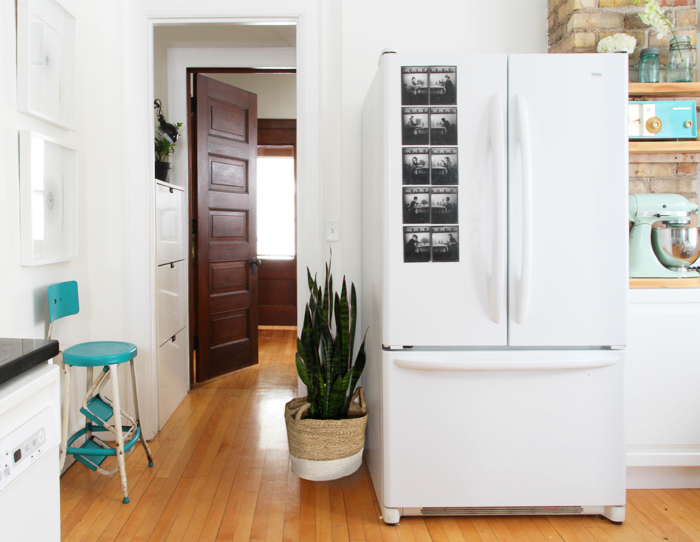
Today I’ll be sharing with you the rest of the first floor of the house. The biggest and most recent update, of course, was the kitchen renovation that I worked on over the fall. If you’ve been following along you know that I painted and restored all the cabinets and hardware, replaced the backsplash and added new cabinets and shelving to one corner.
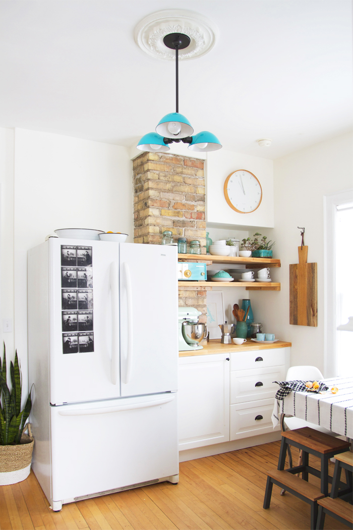
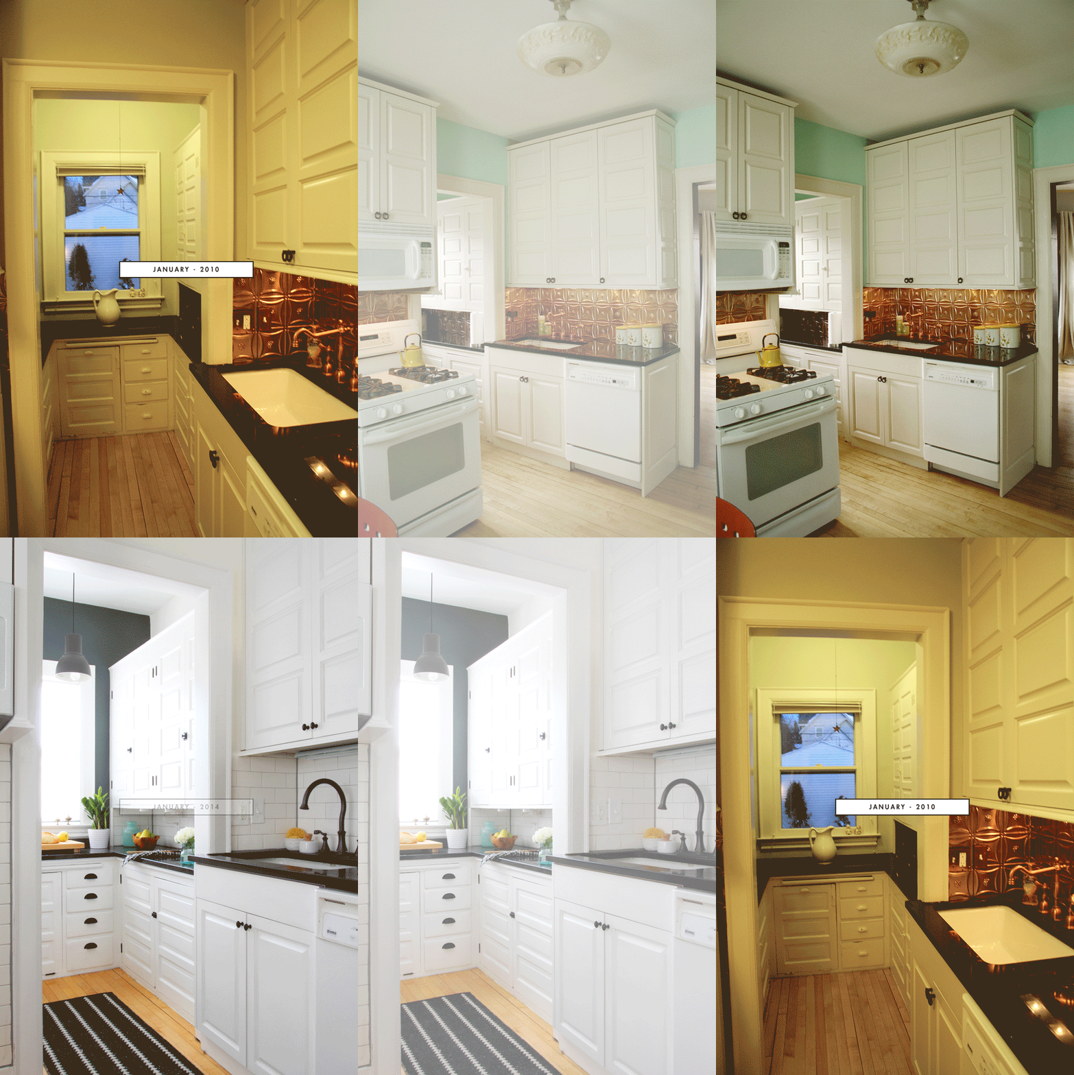
As I did in the last post, I made a little animated gif so you can see the transformation over time. Shortly after moving in I painted the kitchen aqua in an attempt to embrace the copper. It was a good attempt, and I didn’t hate the vintage-kitschy vibe that was going on, but it wasn’t us and I never loved it.
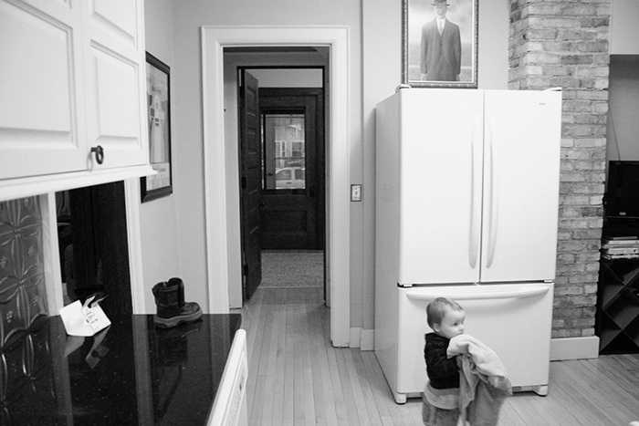
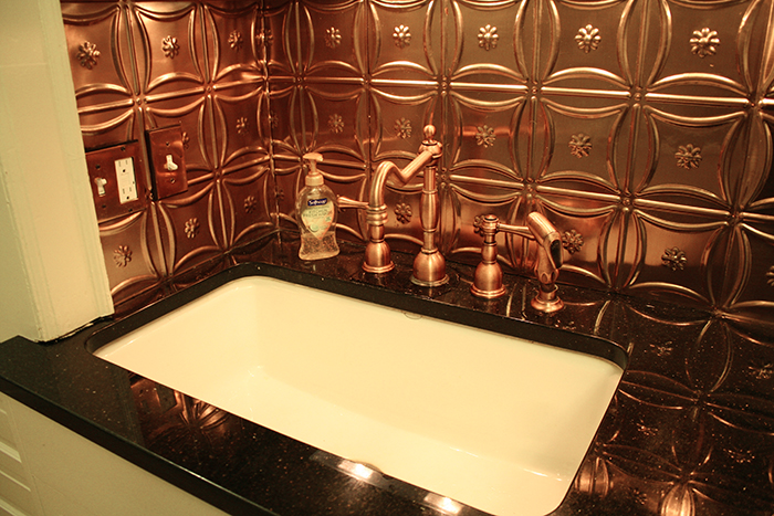
I got a bit of flack on Design Sponge for tossing out the copper backsplash, but I had to share this photo gem I recently uncovered. I hope this image explains how dire this copper sitch actually was.
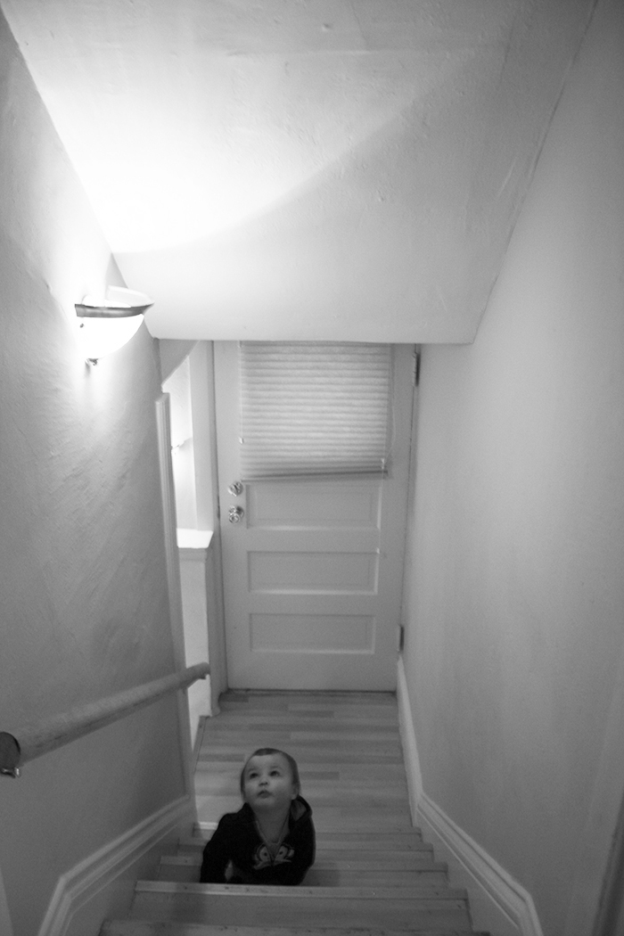
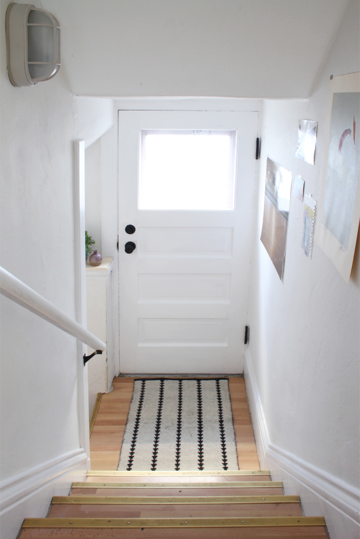
I updated the basement stairway in 2013, and I’m so glad I did. I couldn’t take much more of those scalloped brass light fixtures. I think it’s important to give a little love to even the most mundane spaces.
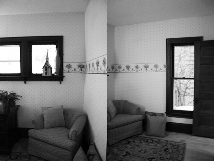
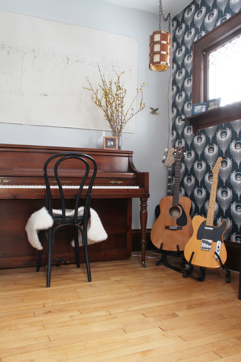
Our first big project was when we removed the floral wallpaper from the music room and replaced it with feather wallpaper from Ferm Living at the end of 2011. We also repaired, skim coated and painted the walls a light grey. We’re so happy with how things turned out in here.
Stay tuned for more of the recap!





So bright and cheery! My eyes thank you
Thanks, Caroline!
The work you did in the kitchen is so impressive! I love how you made that weird alcove next to the fridge into such a beautiful and functional space. So well done! Go you!
Thanks, Jessica! I swear it took me the entire four years to figure out what to do with that space. Sometimes answers to problems just take a while to show themselves, that’s why I’m always cautious of not making too many big design decisions on the fly. Thank you, again!
Wow!!!! You can tell a lot of thought and hard work went into that kitchen! Great job, great style. Where are your black table stools from? I want to say ikea but not sure…if from ikea what style? I want to copy that idea for my table . Two little boys would love them. Thanks. Ps-love the ideas on your blog. Keep it up.
Hey, Kristy! The stools are from Ikea, good eye. Here is the link to the stool. They only come in natural wood, but I just painted the bases of mine with dark grey paint. They make perfect spots for little butts. My youngest is 2.5 and he rotates between kneeling and sitting on his rear, the stool is good for him.
Yeah for your kitchen! It is so amazing and how I found your blog in the first place. Loving the music room, too!
Angela @ Number Fifty-Three
Thanks, Angela!
Nice redesign, White always makes sense and make us feel fresh like new. And more over it suits all designs also
I Agree!
I feel like you didn’t do that many major changes but just going from that dull color to a bright white changes the whole kitchen! it’s beautiful what you did.
Thanks, Susan! You are right, we haven’t done a lot of “major” things to the house, but I do think these before and afters are a good example of what potential a house can have when someone puts the effort into decorating and maintaing it. There was a lot done to the house that was a result of bad maintenance over the last 15 years or so. There was so much work that had to be done in the details (and still is) throughout the home, like painting trim, restoring the cabinets, replacing the roof, painting the house. It was a lot of work and has taken me the whole four years.
I feel like so many people feel like it’s impossible to have a pretty house – often times this is due to budget restrictions, but you can do so much on a limited budget and a lot of creativity without having to do major upgrades.
Anyway, I know we haven’t knocked down walls or anything, but the kitchen was a lot more than a coat of white paint, we removed the backsplash, replaced it with subway tile, added new cabinetry and built in shelving, restore the 100 year old cabinetry and hardware, and then yes, we did paint it white.
Ive said it before and Ill say it again….I absolutely LOVE your kitchen. Its just so perfect. I love that even thought its modern and fresh, so much of the original detail is still apparent. Im loving this recap series.:)
Love the comic. Big fan of XKCD.I think I didnt make the point clearly about meiitonnng the blog. That wouldnt be wrong per se (and indeed the person who got the job had read my blog too!) – it was the way the person insinuated that they knew *all* about me because they read my blog, and that I was “doing quite well” to have a blog, and that it was “not a bad attempt” at having a blog. I dont appreciate being patronised, especially when I am hiring! so it wasnt the fact that they had read it (indeed, I would probably expect someone to have googled me these days) but the way they commented about it which was both out of place… and even slightly creepy! Does that explain more? Jennifer, I totally agree with you!
Generals have *always* been political creatures of one from or another. This is why, since the 19th century or so, it has been the Colonels who have led the various military juntas throughout the Third World. But the US has placed such severe limits on the amount of sustainable forces under a given Colonel's command that it would take a cabal of such men to effect any military action against (or without) the orders of their Generals.
I liked this contemporary design. The combination of white with other colours really makes it as a unique and elegant design.
One of the best Builders in Kerala. From Thrissur, Elite Developers. https://www.elitedevelopers.co.in/