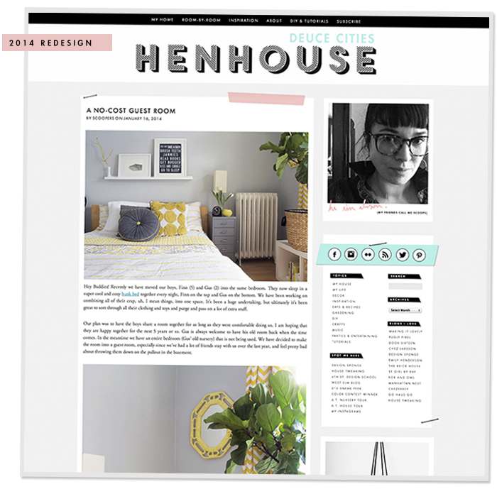
Hello Friends! I know I’ve been missing in action the last few days, that’s because I’ve had my head down while working hard on a new blog redesign. This is something I’ve had on my to-do list for a long, long time.
It’s been two years since I launched the first version of the current design, back when I moved from blogger to wordpress. Since then I’ve done a lot of tweaking and am really happy with the blog in it’s current state. I am restless though, I love coding CSS and I have had this re-design project on the radar for a whole year.
I’d thought I’d take a sec and let you in on some of the behind the scenes details for those of you who are interested. I am using Thesis 1.8.5 via wordpress to run the current site. This theme is great and I feel like I’m pretty proficient with it, but a year and half ago, DIY themes (the creators of the Thesis theme), rolled out the new version Thesis 2, and discontinued updates of the old Thesis 1. I knew to stay current I would eventually have to take the plunge and tackle Thesis 2. The new version requires a complete site rebuild – there is no easy transition from old to new here. I saw it as an opportunity to update the site, and see what this new version of Thesis could do.
I’ve basically built this skin from the ground up. Thesis allows for drag and drop layout of HTML containers and boxes. This means that I can create almost anything I dream up. The other great thing is that I can change the layout from page to page. Meaning the blog doesn’t have to exist in one static vertical blog style format, I can create custom looks for specific pages. I’m really hoping to come up with some highly cool layouts on the “House Tour” and “DIY” pages.
I’ve also learned a lot more about HTML and CSS since the last design at the beginning of 2012, and I am excited to implement what I have learned into the new look. I’m really happy with the way things are going so far. My goal is to create a very simple site design, staying consistent with colors and concepts from the current design while adding a lot of new understated, yet fancy touches and details.
If all goes well, I’m hoping that I’ll be ready to launch this new baby around the beginning of March. I’ll give you guys a heads up when it gets closer because these transitions never go smoothly for me, and I’m guessing it will take me the better part of a day to have it just the way I want it. Fingers crossed.
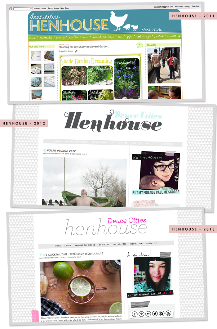
I thought I’d share a few of the old blog designs with you guys, cause that’s always fun to do.
Woof – that first one was a dog.
In other news, I’m still waiting for my upholstery fabric to arrive and until it does, I’ve been sitting in house-project-limbo. I’ve got my sewing machine all ready to go, and will be tearing into those new cushions as soon as that fabric gets here! In the meantime I’ve got all this extra time to work on the site design, so I’ll just be over here happily coding away.




Gah girl! Kudos to you! Coding and I are NOT besties. The new site is going to be fabulous.
Thanks Shavonda!
Lovely! It’s time for me to do the same, but ugh. I want a magic wand!
I know that once you get into it, you’ll love it – you’re so good at that stuff. Did you ever get a local copy of your site set up? That has been key for me.
I haven’t, but I will! It’s only been on my to do list since you sent me that email :) We’re redesigning the magazine’s website right now. Maybe when that’s done I’ll find some time to work on my own!
Sounds like a great plan! How did you teach yourself HTML/CSS? Any recommendations for where to start?
Good question Katharine! I’ve been learning to code since I was a teen in the mid 90’s, the hardest part has been trying to stay current. There is always more to learn. I would start by suggesting you use the ‘inspect element tool’ in the google chrome. It allows you to play around with the CSS and see what the cause and effect of changing styles is. I also highly recommend this book “head first CSS and HTML” for people starting out – I reference it often (I keep it on my night stand) – it’s my go to for bedtime reading.
It just keeps getting better and better!
I hope so! I am excited about sharing the new site with you guys!
Oooh, CSS is so much fun to code! I love how your designs seem to stick to a light grey theme – it really makes your (already beautiful) photos pop out. Looking forward to seeing this go live…but in the mean time, have fun coding! :)
I will have fun! Don’t worry! I do love me some grey – it’s my favorite neutral :)