Hey guys! Just over here finishing up a bunch of small projects left in the kitchen. I’m still waiting for the new light fixture to arrive before I can show the big kitchen makeover to you! I can barely stand it.
In the meantime, let me talk to you about my kitchen table.
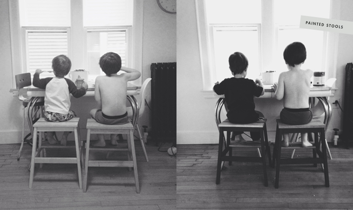
I bought this table at a garage sale when I was 17 in anticipation of moving out of my folks’ place and into my own apartment someday. I’ve had this table forever, and I totally am all sentimental about it. It’s been with me all of my adult life, and now my kids eat at it 3 times a day, I mean look at ’em, too cute! I can’t part with with the table, and I need to make it work in our new kitchen space.
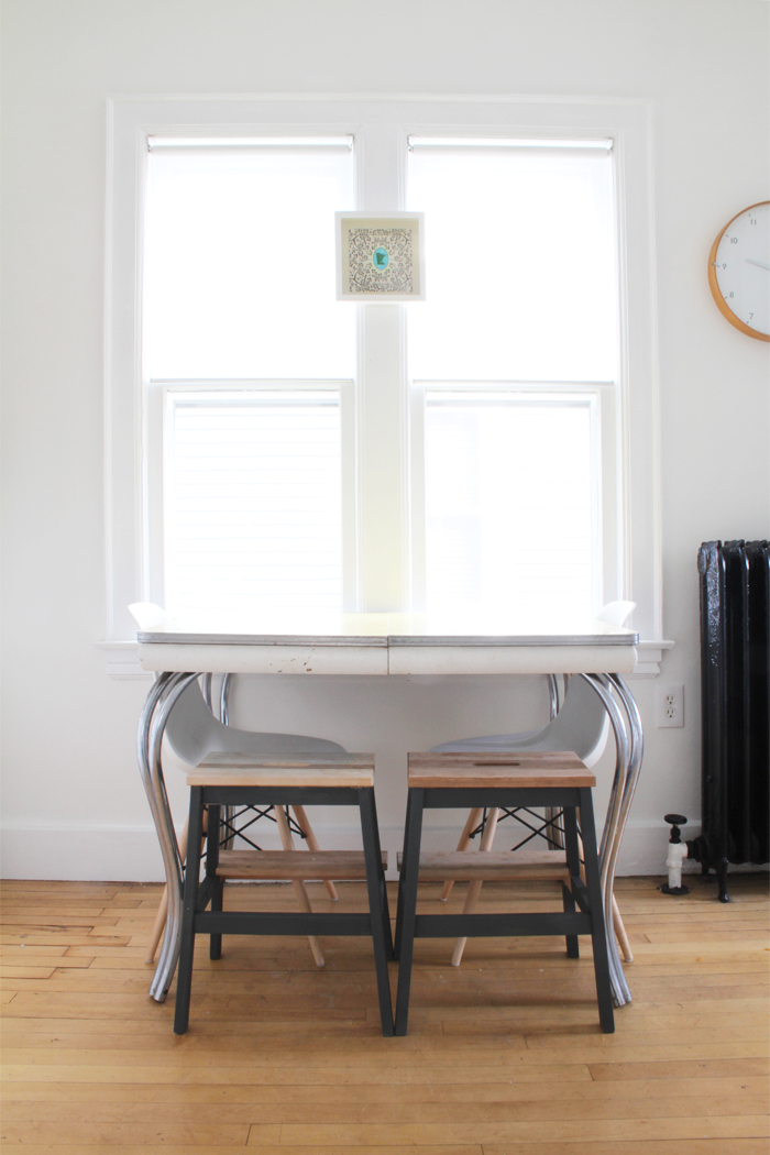
Right now, it’s kinda just hanging out, all alone – not relating to anything.
“Come on table, no man is an island, you need to get with the kitchen program, and start looking like you belong here already!”
Seriously though, I am kind of at a loss for incorporating this vintage yellow formica table with it’s chrome curvy legs into my new, fresh, semi-minimalist, semi-industrial kitchen. I do have a few ideas, but I don’t know if any of them are really the right solution.
First, I painted the kids eatin’ stools grey on the bottom, the same dark grey I used in the pantry in mudroom. I left the top seat and step area the natural wood, and will oil them up, so they are lush and velvety like the new butcher block counter and shelves in the kitchen. I like the stools mucho better now that the bases are painted.
I also added some artwork to hang in the window. Now that everything is white, the double window just felt like a vast bright hole on top of the white walls. Maybe, I’m just not used to white everywhere, but I thought adding a small framed piece above the table might give the eat-in space some weight spacially, so it’s not just alone, floating in a field of white below the window. That one little print really works, and makes the table feel more incorporated into the space.
I didn’t really have anything in mind for the artwork I would use, so I started looking around the house. I grabbed this “Heart Minnesota” print from the dining room – It’s turquoise, black and white, the perfect size, and it relates to my Minnesota plate collection. So, win, win, win. However, if I need more seafoam/turquoise/teal in my kitchen life, I think I’d consider replacing the print with this paper cut chain of lakes from the Crafterall shop on Etsy.
Basically, I’m trying to disguise this table with other cool stuff, so you just don’t notice it. Styling is not my strong suit, so I’m just working by trial and error here.
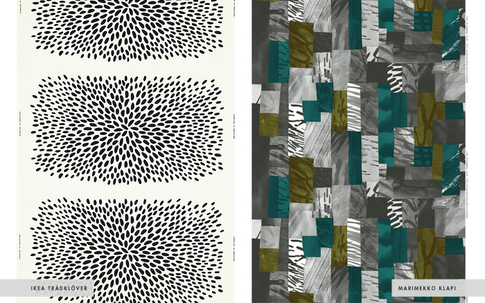
Maybe the solution to all my problems is easy, just hide it under a tablecloth. I haven’t run into a lot of tablecloths that I love or would work in the space. This table is tiny, 30″ x 40″, standard size table cloths won’t really work. I think I could get away with sewing some fabric and making my own tablecloth for relatively inexpensive. I think either of the above fabric patterns could work. I like the price and the simplicity of the Ikea fabric, and I like the color and print of the Marimekko. Even though the Marimekko pattern boasts dark teal, I think that’s okay, I want the blues in my kitchen to range from seafoam to teal.
I like both fabrics equally, but I think Ikea might have Marimekko beat on the price. I already feel like I’ve gone over budget on this project and I don’t think I need to spend tons more money than I have to. I’m going to take an Ikea trip later this week, and see what I think of the Trådklöver fabric in person.
I’m still not sure a table cloth is really the solution, but it seems like it could have some merit. I’d be open to suggestions if any of you cool people have ideas on what I can do to incorporate this old table into the space.
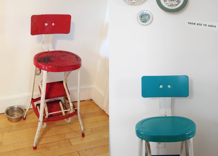
Also, I totally painted this red high chair aqua. It was a toss up between aqua or and black, and I figured a little more aqua wouldn’t hurt anybody. Guys, I have a new found love of spray paint, I love it big time.
We still use this high chair all the time, I babysit my friends’ girl, Penny, three days a week, and she needs a place to sit at the table too. Plus, it’s kinda cute, so it can just chill over in the corner, under the plate collection when it’s not in use.





Loving the highchair with aqua paint!! Question – how do you spray paint in MN when the weather is less than stellar? I have a tall (stand alone) lamp that I decided needed a new color last week…but I feel like it’s going to be for-ev-er until I can get outside and spray it down!
You would’ve laughed at me, but I was outside in the little bit of snow we had two weeks ago spray painting. I just threw down some cardboard so I wouldn’t have blue snow and grass, as well as to prevent the legs from getting buried in the snow and ruin the paint job. It was probably okay to spray paint then, the weather was in the mid-30’s. I’m sure it’s not recommended by the manufacturer, but it worked for me!
You should spray paint that lamp today or tomorrow, the weather will be warm enough for it!
I’ve had one of those paper cuts of Lake Hiawatha for EVER and just haven’t figured out where to put it! Maybe the kitchen is the place…
Do it Cam!
This idea might be lame and/or implausible, but I’m throwing it out there anyway.
Add fabric, or paper, decopage-style. Spray paint legs, or not. I’m always wanting to change the surface of things decopage-style, haven’t actually done it much but have a stash of items I plan to try it with. I also love cool fine art paper and am always looking for uses for it. Can’t wait to see the final kitchen post!
Hi, Scoops! Long-time lurker here. I love love LOVE what you’ve done with your kitchen. I thought the cabinet/shelves around the chimney was brilliant, yet didn’t bother to de-lurk to say so. Everything is looking so great! But I see why this little area is giving you trouble. I think the problem is not so much the table, but the fact that the stuff on this wall doesn’t seem to be engaging with the rest of the kitchen and the table kind of looks as if it’s just been plunked there for no reason. Instead of a tablecloth, what about using the Marimekko fabric (or similar but cheaper) to do something on the windows? Even a simple valance across the top of the windows would help pull everything together.
I actually like the table and I think it works with the overall vintage/mod vibe of your house. Unfortunately, I think one of the things making it feel out of place in your kitchen is that the straight lines of the boys’ stools are totally fighting with the table’s great curves. If you’re headed to Ikea anyway, check out the Marius stool. It’s cute and curvy and metal, and it comes in both turquoise and black (well, white too). Turquoise would relate to the rest of the room, but the black would tie into your gray and to the metal cross-bracey-things on your Eames chairs. Or keep an eye out for Ikea Frosta stools on eBay and paint them gray to match.
Add a vase or a vintage Mason jar (turquoise!) with some pretty flowers to the table (right against the window wall so it’s out of the way) and it will start to feel more like an intentional space and less like something you’re trying to disguise. The table has sentimental value, so embrace its quirks!
Oh man, my own reply just got deleted while I was typing it, so lame. Now I’m totally going to rush this re-write and probably not do the thoughtfulness of the other justice.
Anyway it went something like this..
Hey Megan! I gotta thank you for cutting right to the chase and being honest about the space with me. You are totally right, that table is just floating out there in no-mans land and needs to be grounded. I don’t know if I am really a valance type of a girl, but yes, I think something on the windows probably has to be done, doesn’t it?
I have two panels of black and white curtains from Ikea, they are the same ones that hang in my music room, link here. I think they would actually look great in the space, I think if I were to use them I’d have to hang them floor length style and hope that messy hands didn’t ruin them, or do something I was trying to step away from, and make cafe curtains. We just had cafe curtains hanging in the kitchen, and I really wanted to try something new. The old curtains were way more cutesy and church basementy, if I did it again I’d have to try out some ring clips and some flat panels to try and make it more modern. I need to look into this option though, and will be dragging my black and white panels as soon as I get done composing this email.
Uh, how did I not see those Ikea stools? I think my mind was just all about the wood stools, because I actually do need them in the kitchen, I’m 5’4″ and I can’t reach much beyond the 2nd level of shelves on the upper cabinet. So to me it was functional and functional. I do think the grey paint makes the current stools look better than when they were bare wood, the lines move to the background more, but I would consider these stools. I will probably grab a pair of the aqua stools next time I’m at Ikea, worse case scenario, I take them back, right?
I know the table top needs something too, I’ll probably try and make it look pretty and styled up for pictures, but realistically, on a daily usage basis, having extra vessels on the table will make it hard to fit all the milk and ketchup containers that we need during any given meal. My kids are ketchup crazy.
Thanks for coming out of the woodwork! I wanna see you around here more often!!!
I love this table. Always admiring it when it appeared in post pictures. Me, personally, would keep the table. I’d bust out a steel crochet hook and set out on a tablecloth adventure. You can even dye the finished cloth to your color preference. I found something on etsy that is what I’m talking about. http://www.etsy.com/listing/114701968/ready-to-ship-indigo-hand-dyed-vintage. Good luck!
Those linens and crocheted items are totally beautiful and just increase my already out of control love affair with blue. I actually did bust out a crochet hook last week in attempts to do something, but I think it was an idea fail.
Stencils are fun, too! Vertical lines on the side (not the metal part but below) of the table… could even throw in some red (I LOVE red w/ teal, black and gray!) — and on the top you could do stripes or herringbone or rectangles…
there’s counter top paint out there….
cuttingedgestencils.com
good luck – can’t wait for the reveal ;-)
Thanks Everyone for all your good ideas. I will consider them all and start looking of examples of how I might execute these in this space. You guys are def inspiring me, can’t thank you enough!
The turquoise stool is blowing my mind! A total transformation. Scoops, did you know you are the coolest? I can’t wait to see this amazing space in real life next month!
KJ, get back here already, I miss you and I want you and Matt to make me some cool foodz in the new kitchen!
Miss you so bad!
Hey! Just noticed that the Marimekko fabric is on sale! Do it!