My kitchen is really good at being segmented. Remember the floor plan I shared with you from the other day? There is the “pantry” and mudroom areas, the main kitchen area, and then there is this strange chopped-up wall on the far side of the room. When I took this photo on the lower right, I made this wall look good. It’s all thanks to a little styling trick I call cropping. See, no fridge! Honestly that wall really doesn’t look anywhere close to that good in real life. It’s a strange place on that side of the kitchen.
 Lined up on one wall is an entry way, a huge refrigerator, a brick chimney, and a little cove where a stairway used to be. The stairway was removed and the wall closed off a long time as a way to save space I assume. Do you see what I’m saying about that wall though? Weird and choppy!
I thought if I’m spending so much time making the rest of the kitchen look beautiful, I better address this crazy wall too.
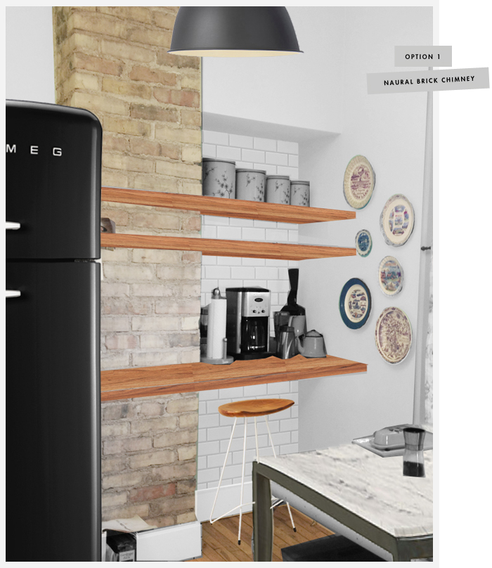
The above photo is the solution I have come up with to make this space cooler. I figure why not unify the wall with a few shelves, the lowest of them being counter depth. I could buy some butcher block for a reasonable price and use cleats to mount the shelves to the wall. The wall and shelving could function as a “baking area”. Imagine this: I have my mixer, a few cute bowls and canister set all hanging out on those nice new shelves. It would look pretty, right? Then maybe someday I could get a nice fancy fridge and a marble table! Last year I was gushing over this marble table in this old kitchen that I had seen in the BHG magazine. The table could be multi functional, using it for casual family dinners and as extra space for baking! I mean who doesn’t need a baking zone – I’m not really sold on the baking zone idea, but it’s the best use of the space I can think of so far. Best other idea would be to use it as a coffee zone. Decisions, decisions.
I really like the idea of tiling the cove area on the right side of the wall with subway tile, just like the rest of the kitchen’s backsplashes will be. I think the tile would make the wall feel more integrated into the rest of the space. I’m not so sure about the brick chimney though. Do I keep it the way it is, or is it becoming too much of an eye sore in the room? I could frame it out and drywall around it, or I could paint it white. Each have their pros and cons. Lemme ‘splain.
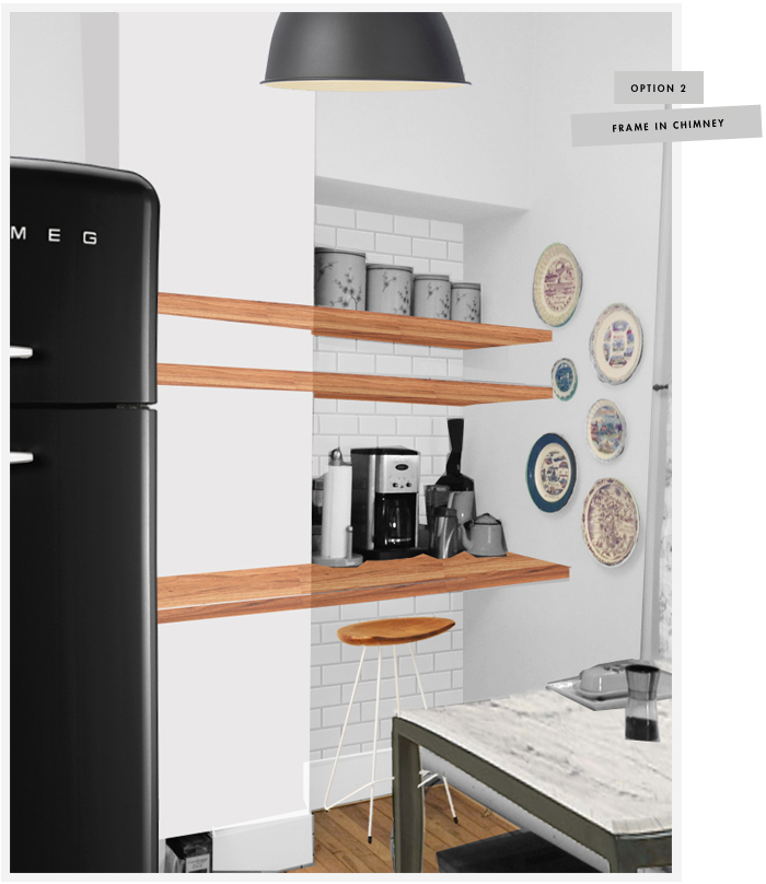
I think this looks amazing drywalled and painted white, but I don’t know if I could live with myself covering up that old brick. Plus drywalling is probably more work than I really want. I mean, I’m still painting these cabinets and it’s taking me for-ev-er. Do I really want another big project for myself?
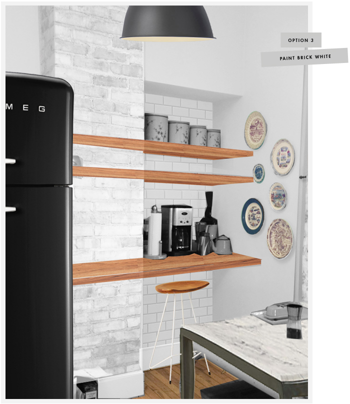
I could compromise and paint the brick white. The cons of course are permanently changing the brick. Plus I think there may be too many competing patterns with the white subway tile in addition to white brick. What do you think?
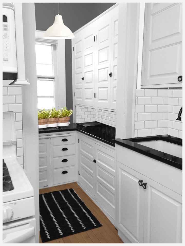
Here is an updated photoshopped version of the pantry area. I think it should give you a sense for how the rest of the kitchen should look and how the “weird wall” could relate to the rest of the kitchen if it was spiffed up with tile and butcher block shelves.
What would you do? Do you like the idea of the shelves at all? Would you keep the chimney au naturale or would you update it a bit?


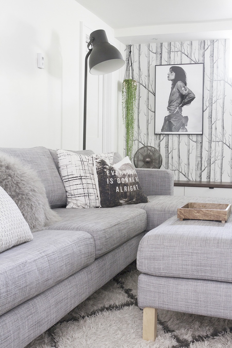


I just came across your blog from a google search of “teal dining room” and just had to let you know I LOVE YOUR SENSE OF STYLE! Your home is gorgeous!!!!
Do you mind if I share a photo of your teal living room on my blog? I love the color you used and am thinking about using something similar in the dining room of the house we just bought!
:)
Shannon
Hey Shannon! I’m glad you think I have a cool sense of style, that totally makes my day. Yes, you can totally use any photos you like, just link back to my blog if you don’t mind.
Thanks!
I would wait to decide on the brick until the other elements of the room are in place. You might like the texture of natural brick in contrast to the white…or you might hate it with every fiber of your being. Either way, you’ll know.
I probably am jumping the gun a little bit. This is just the way my mind works. I suppose I can almost 100% rule out the drywall, even though it looks pretty, it’s probably too much work. Any I can always make a decision about the brick after I get the shelves up.
Wile I’m not an expert by any stretch of the imagination, or even a beginner for that matter, I think to drywall the brick, you need to frame it out thereby adding bulk to the overall profile of it. I’m not sure how much bulk it would end up being, but it may change the amount of free space you have available to work with. But I do agree, if you decide to go with that subway tile in the nook, whether you paint the brick or not, it certainly is a bit visually jarring between the three different colours and textures you have going on there in the first two images. I think I would be inclined to leave the chimney as is, and my husband most certainly would be, but I can certainly see the challenges that imposes.
If any of your past decor choices are any indication, you will ultimately make the right decision :-)
So you think the natural brick is the way to go? Do you like the look of the shelves, or is it not doing what I was hoping it would do? This area is so tough.
I love your plans for the kitchen! In my previous home, I had a terrible faux brick back splash. It was a bright reddish color. UGH. I wasn’t in a position where I could remodel, so I painted it all white. It actually turned out way better than I thought it would. And the texture of the bricks was a nice element in the kitchen. So, my vote is to paint it white. I can send photos if you’re interested.
I like the look of the white, but I am not sure I’m comfortable yet painting it. One of the other commenters suggested I just live with the unfinished brick and then decide. I probably should do that, and I guess I’m putting the cart before the horse a bit. I’m just a girl who likes a good plan. Your kitchen sounds totally cute, if you have a link to your pics feel free to post them or email me!
What do you think of the shelves, is that a cool idea or am I over thinking it?
I LOVE the shelves! Perhaps leaving it natural for awhile is a good idea. Live with it for awhile and let the right answer come to you. You always make great decisions in your house.
I don’t think I would put subway tile in that area unless you drywall over the brick; too similar yet different. And not the unifying idea that you are wanting, but maybe just embrace that little area as unique? Like the 3 little walls, or even the back wall be painted their own color (the awesome aqua it already is?). I do think that the long shelves help with the unity aspect. Fun to see all your ideas!
Definitely yes to the shelves. Maybe use reclaimed wood instead of butcher block? It could tie in the rustic-ness of the brick. Love the Smeg!
I typically LOVE brick fireplaces painted white, but I agree that it might be too much texture or something to paint this chimney white. I love how the original brick would mix the new beautiful modern kitchen with the old industrial look. I cannot wait to see the final kitchen! I also live in the twin cities and hope to find a home as beautiful as your when my husband and I both graduate from college!
Awh, thanks Lacy, that’s sweet of you to say. All old Minneapolis houses are sweet and awesome, so as long as you pick one of those you should be good to go :)
Good luck with school, my husband and I did that whole thing too – married while in school, and with a baby to boot. It’s a relief when it’s all over, hang in there!
Okay guys! You are all awesome and I am glad you are leaving me so many cool comments about this strange corner, I really appreciate them and need your feedback! Sometimes I have a vision but I can’t always see the best way to execute it. Although I still kinda like the subway tile backsplash idea in the cove area, I hear you all. It’s probably a lot of pattern and texture all in one place. I’lI just probably wait on the tile, paint it white, and get a better feel for the space before I really decide. You also told me that you like the shelf idea and Jessica even suggested considering some other options such as reclaimed wood. Although I like that idea, I might potentially be preparing food on the counter and I don’t know if reclaimed wood is cool for food prep, and I’m also thinking about cost. I could get 2 pieces of butcher block from Ikea for just a little over $300, I can deal with that price.
I am a crazy planner, you should all know that by now. So, just because I can’t resist I mocked the space up, leaving the cove white – no tile, the brick natural and keeping the butcher block countertop and shelves. Wadda you think of this?:
On the left: the most recent plan. On the right: The kitchen how it looks now.
I like it, and it looks the easiest to do too. I can’t believe how much you get done, especially looking after children too! I am in awe…
I schedule out my entire day from morning till night, it’s the only way I can make time for these projects. I take full advantage of each and every nap time.
I’m always a sucker for the rustic look, but I really like the new mock-up: natural brick, no tile, and butcher block shelves. I love the cute stool you added too. (Bonus that this option requires the least amount of work!) :)
Yes it is a total bonus, I guess I was over thinking it a bit, I do that sometimes. Thanks for all the feedback, it really does help!
Looks amazadog! We have a reclaimed wood dining table and it was finished in a way that is food safe. Sand and finish with food grade mineral oil and it could be free thus freeing up that 300 bucks to put toward the smeg!
Man, if I knew you in real life we would be friends. Amazadog. I would say that.
Did you make the table, if so, was it hard, would I have to be a carpenter? Do I need a table saw and a planer? I don’t have any of that stuff.
I like this idea though. Maybe…
The Smeg is only a dream, I love it, but would be worried that it couldn’t hold 3 gallons of milk and a case of american cheese.
Def need a new fridge, new stove, new dishwasher someday. I have a crush on this guy too, you know, for when I have a few G’s to drop on a stove.
Oh man that stove!!!
Our table was made by a hippy wood shaman in a small town on the northern tip of Vancouver Island. He took beams from a heritage building that my father-in-law restored and made us a table! I specified matte black hairpin legs with a dark hand-scraped finish on the top and it is beautiful. No nails, no screws (except to attach the legs). I’m assuming he used biscuits to join it which would be a total pain to try at home I think.
However, there is this: http://www.apartmenttherapy.com/the-diy-gods-of-spanish-harlem-139813
Also, we would def be friends!
So I found this kitchen today and it reminded me of a European version of yours (white cabinets, black countertop, white Eames chairs) — just needs white subway tile! Check out the natural brick and how lovely it looks! http://lovelylife.se/articles/2013/09/12/hemma-hos-annacate
Yes! I love this whole house. Thanks for passing it along.
Recognizing fully that I’m a more-is-more believer when it comes to subway tile (and I think you’re right to think that adding it to that area will help unify it with the rest of the space…), I say tile that! Also paint that brick! I guess wait until more stuff is in place if you’re nervous, but I don’t think painted brick and subway tile compete. The brick is texture, the tile is pattern. Or something. Anyway, I think it would be nice.
I think it’s a good possibility that I will become a member of the more-is-more club. Once I start to see the tile go up and the kitchen come together, I’m not sure I will be able to resist its (tile’s) powers. Making that weird space work is just as important as having that weird space relate to the rest of the kitchen – I think subway tile may be the key.