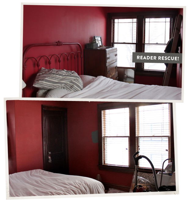
I had a new reader (Anna) get in touch with me recently. She had been in a style rut and was looking for help with the master bedroom of her 1916 South Minneapolis home. She was striving for a way to incorporate modern style while still allowing the room to breath and exist as part of an actual turn-of-the-century house. Of course I was ready to help her! It was fun for me to think about my design aesthetic in someone else’s home, and I thought I could use her experience to share insight with you too.
Anna had already laid some good groundwork: she had already painted the bedroom a light shade of turquoise (perfect for a bedroom) and purchased a few key items; including a dresser with modern lines from Room and Board, and a platinum Jute rug from West Elm.
My hope was to help her build off of that and give her some perspective on the design choices she had already made, while also trying to incorporate her wish list items into a solid plan for the future.
She had a few specific things she wanted to be considered: addressing the headboard, finding a pair of nightstands, identifying pillows that added a pop of color, deciding whether or not she should hang curtains, finding swing arm lamps to hang above her bedside table… and of course doing it all with a vintage modern style.
The plan that came out of our conversations wasn’t meant to be set in stone, but to be used as a loose set of instructions for how she (or you for that matter) could apply these ideas to her room (or yours).
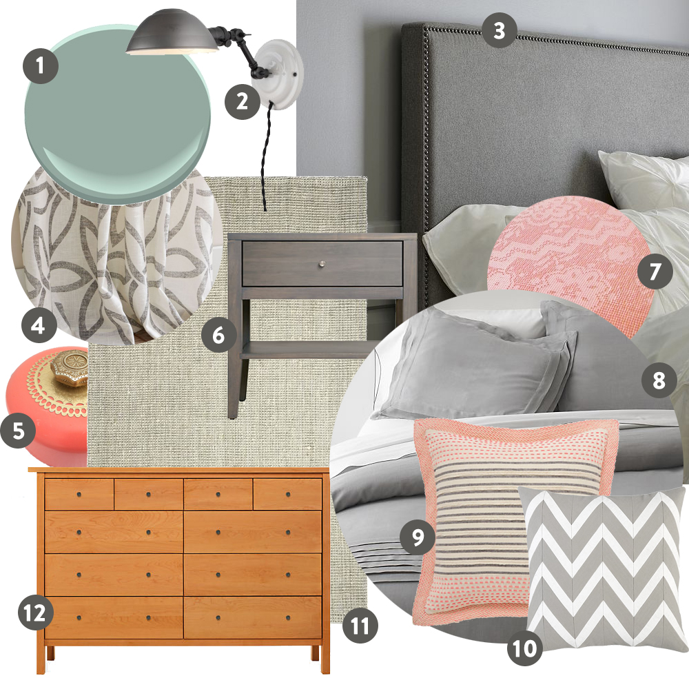

And here you have it. A bedroom that’s bright, airy, vintage, and modern, using blue with a touch of coral. This bedroom is all about layering neutrals, subtle patterns and colors while incorporating small touches of vintage accessories and accents like the swing arm lamp pictured above.
Psst, try adding some navy accents for a different look :)
|
1 Stratton Blue paint from Benjamin Moore 2 Princeton Sophomore Wall Sconce from School House Electric Anna was looking to incorporate some vintage accents back into her space and give a nod to the period of the house, and this wall sconce does just that. Made by School Electric, the adjustable arm and task lighting allows for easy book reading in bed, and the white enamel base keeps it casual. 3 Nailhead upholstered headboard from West Elm Think of this headboard as a placeholder for any streamlined headboard in any sort of neutral color. All could easily work in this space. 4 Pinwheel Curtains from West Elm I’ve used this curtain as an example in both of the moodboards. A simple graphic neutral curtain would work well in either of these spaces. With the solid rug and bedding, a graphic print in the curtain is just what this room needs. 5 Vintage Coral Accessories In my home I always add a lot of color with my vintage accessories, and this is what I recommend doing here. Vintage pieces are fun, and lots of times reflective of our own personalities. This is an easy way to add some of yourself to the space. Stick with a specific color (or two) as a theme, and it will all work together. 6 Calvin Nightstand from Room & Board I love the gray stain of this side table, but really any piece of furniture with modern lines and simple style will work well here. 7 Vintage Bedding from Etsy Adding a vintage blanket to the foot of this bed would be another great way to give a nod to the old bones of a home while at the same time adding color to a space. In this case, coral will look great on this gray duvet, but if you have a colorful bedspread consider searching for a neutral vintage blanket. 8 Pietra Bed Linens from Crate and Barrel I like my bed linens like I like my furniture, neutral as fugg. You can always add color with pillows and throws and your duvet will stay happy on your bed much, much longer. 9 Stitch Striped Pillow from Anthropologie Guys, I love this pillow, like in a serious huge crush on sort of way. I’ve added it to my virtual shopping cart like a million times. I think I need to wait a week or two and see if I still love it so much because, if I do, I need it. Anyways, this is the perfect example of adding color, texture and pattern using pillows. 10 Chevron Pillow from Crate & Barrel Let’s get graphic with pillows. Pillows are the perfect place to add the graphic element your room was looking for. Just make sure to follow your color palette and you’re golden. In this instance the gray of the chevron stripes has the perfect amount of yellow undertones to balance well with the light turquoise walls. 11 Jute Bouclé Rug from West Elm Here you go, a perfectly neutral rug made from natural fibers. Gives a slight nod to a beachy sort of vibe, but the platinum is a good buffer and allows the jute turquoise combo not to get too beachified. Any fiber rug would do the trick here, and you could even sub out the solid gray for a big graphic neutral pattern and then of course just keep your curtains solid. Either works! 12 Sherwood Dresser from Room & Board Anna had this nice dresser already purchased from Room and Board. The modern lines keep her furniture pieces unified even though they have difference stains and knobs. You could even have a white dresser with straight lines and everything would still work. |

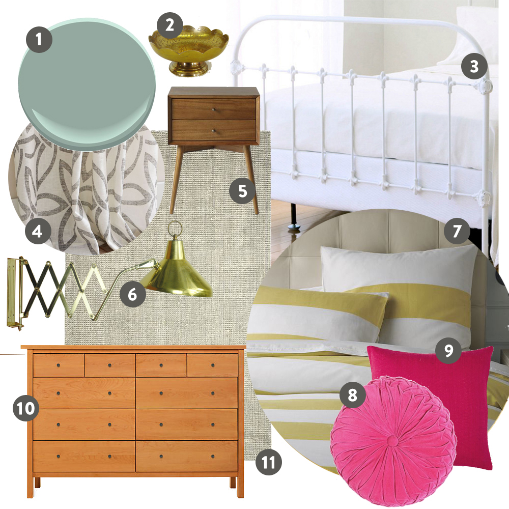
Now here’s the second moodboard for all those who love a burst of bright color and a tiny bit of bling too. A little more feminine than the first choice but also very modern, clean and vintage.
|
1 Stratton Blue paint from Benjamin Moore 2 Vintage Brass Accessories You have my permission (like you really need my permission) to go nuts with vintage brass accessories in this room. Think all sorts of bedroomy things, like trays for bedside tables, jewelry holders, bookends, candle sticks. Okay, yes, you can overdo it, but a few key vintage brass pieces are clutch for this style. 3 White Wrought Iron headboard from Garnett Hill Anna was into the idea of chucking her headboard, which I totally get. Maybe she’s had it for ten years and just needs something new, I dunno. Sometimes you just get over things, but, I personally love her headboard and I think it could work great in her space. All it needs is a new white glossy paint job and it’s good to go. So here’s me trying to convince her to give new life to her old head board. 4 Pinwheel Curtains from West Elm I’ve used this curtain as an example in both of the moodboards. A simple graphic neutral curtain would work well in either of these spaces. With the solid rug and bedding, a graphic print in the curtain is just what this room needs. 5 Mid Century Nightstand from West Elm This bedside table from West Elm would be the perfect way to get that Midcentury look in your room. It also comes in white, which I love and adore with all my heart and soul. 6 Vintage Brass Accordion Lamp on Ebay Wanna make your friends jealous? Take that $250 bucks you have burning a hole in your pocket, go over to ebay and buy this sucker right now!. If only it was about $175 less expensive it would already be illuminating my living room. 7 Graphic Yellow Striped Duvet Cover from West Elm In the first mockup I went neutral with the bed linens, in this mock up, I wanted to show you that you can also go bold and graphic. Both work. The overall look is just more in your face and bright, but both are good. It all depends on which one you are; loud and crazy, or calm and classy. I’m always loud and crazy. 8 Round Pinktuck Pillow from Urban Outfitters I love the vintage texture of this hot pink pintuck pillow. When your bedding is graphic and your pillows are bold, incorporate textures to add another layer. 9 Pink Silk Pillow from West Elm Hot Pink Pillow #2, this one is not as textural as the first but is a good example of how it’s important for your pillows to stay in the same color fam when dealing with bold and graphic bedding. You get too many colors on that bed and it’s gonna start to look a little crazed. 10 Sherwood Dresser from Room & Board Anna had this nice dresser already purchased from Room and Board. The modern lines keep her furniture pieces unified even though they have difference stains and knobs. You could even have a white dresser with straight lines and everything would still work. 11 Jute Bouclé Rug from West Elm Again, we add the neutral jute rug that Anna had already purchased from West Elm. In this new bolder setting it doesn’t come across as “beachy” as the first mock up. Any fiber rug would do the trick here, and you could even sub out the solid gray for a big graphic neutral pattern and then of course just keep your curtains solid. Either works! |
The great thing about this simple vintage modern style is that it’s really easy to mix, match and substitute pieces for others. Here are the “rules”. Keep your furniture pieces consistant. Choose pieces with clean lines that lean towards a modern or midcentury style. Go colorful on your vintage finds, collecting all sorts of different pieces, but all within the same color story. Don’t forget, vintage pieces are best if they are pieces you love and you can relate too. Be bold with pillows and throws, bringing in color, texture, pattern, and vintage elements. You can go bold or neutral with your bed linens, just remember if you go bold your pillows and throws should focus more on texture and color instead of pattern. Last rule, keep your curtains light and neutral, punch it up with a graphic pattern, and now you so have a cool room.


