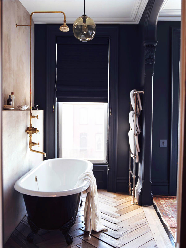
Jenna Lyons Home Featured in Domino Magazine
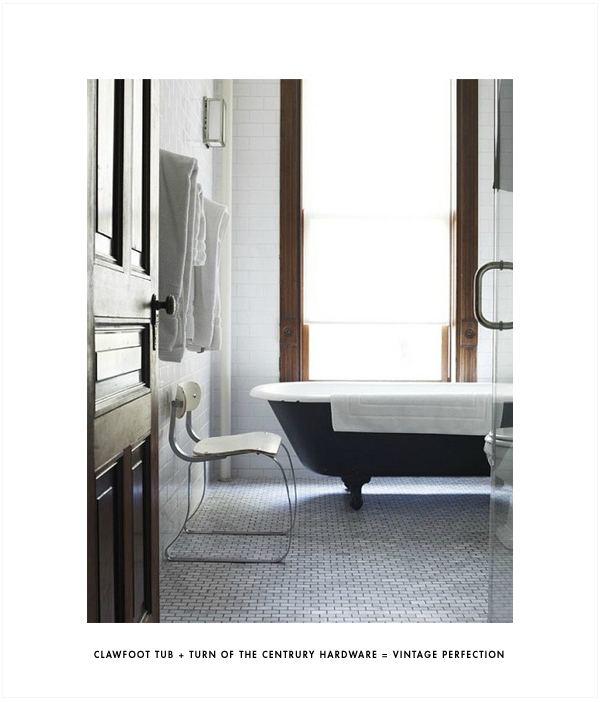
I’ve been overwhelming drawn to black and white bathrooms these days. I’m no where near being in the market for one but if I were to be, I think the final result might end up looking a lot like one of the bathrooms in this post. Black and white is a classic combo for any turn of the century home. You see those colors so often represented in basket weave and honey comb floor tile so popular during this period. It’s often seen in the oil rubbed bronze of hardware, and porcelain doorknobs too. Old houses can be updated to be modern, but I love the idea of an old house giving props to it roots. Updating yes, but maintaing some of that vintage style and setting it off against newer modern elements. For me, this is key in bathrooms and kitchens of old homes.
|
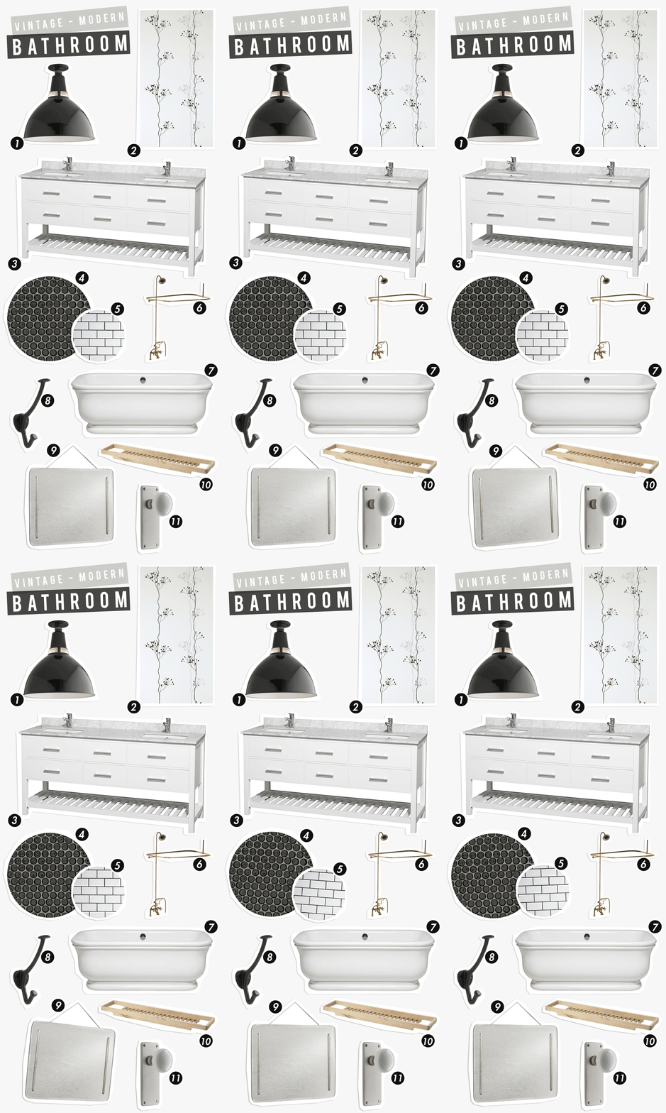
1 Oh my god! Do you know about School House Electric Co? I so love this site. They have thee greatest stuff! Their collection of flush mounted ceiling fixtures is totally amazing, I had three picked out for this post and had to narrow it down to just this one. Talk about pressure. This fixture is super vintage with a modern touch and totally perfect. 2 Who doesn’t adore Ferm Living wallpaper, or for that matter any of their stuff? I’ve had a sample of this Berry Black Wallpaper forever and I hope someday I have a place in my home where I can actually use it. It would look great in our bathroom if the bathroom needed to be overhauled. A wall featuring this wallpaper would be the perfect modern touch for your vintage space. 3 The vanity is the ideal spot to incorporate modern elements into a vintage modern bathroom. This vanity from Modern Bathroom has clean lines but isn’t screaming modern. The marble top is reminiscent of vintage tile floors and looks especially good next to the modern fixtures. 4 Penny tile with black grout I would cover my floors in black (or white) penny tile with black grout in a second if I needed a new bathroom. I’m a little obsessed with the stuff and feel compelled to photograph it anytime I visit a public bathroom clad in those beautiful penny tiles… someday. 5 WHITE SUBWAY TILE WITH BLACK GROUT There’s nothing more classic and vintage then white subway tile with either black or white grout in a bathroom. White subway tile with white grout will read more modern where as the black grout tends to lean more vintage and classic. Either way it’s perfect, you can’t go wrong. 6 I think the key to the look of the first bathroom (pictured above) and second bathroom (pictured below) is the brass fixtures. Although both have beautiful aged patinas, you can still get a similar look with new hardware. The Home Depot, as I’m sure any big box store, sells a handful of brass fixtures specifically for free-standing or claw foot tubs. 7 Vintage cast iron hooks give a nod to the old vibes. 8 It is my dream to have a free-standing or claw foot tub. It was actually a requirement when we purchased our house, and something I had to give in on. So sad, I know. Although I have my heart set on a claw foot tub, I could totally get over it for one of these beautiful free standing tubs. A perfect combo of vintage style and simple curves. 9 A set of two these throw back mirrors from Rejuvination would look perfect vintage accompaniment to a modern vanity. 10 This birch bath organizer from Ikea isn’t a giant slab of wood like in the picture below, but it’s provides the same effect. Natural elements like the birch go perfect in any bathroom. 11 Don’t forget the hardware. This is key to pulling off a vintage look. It’s easy to replace old dated knobs with these replicas, and it instantly adds charm to any room. |
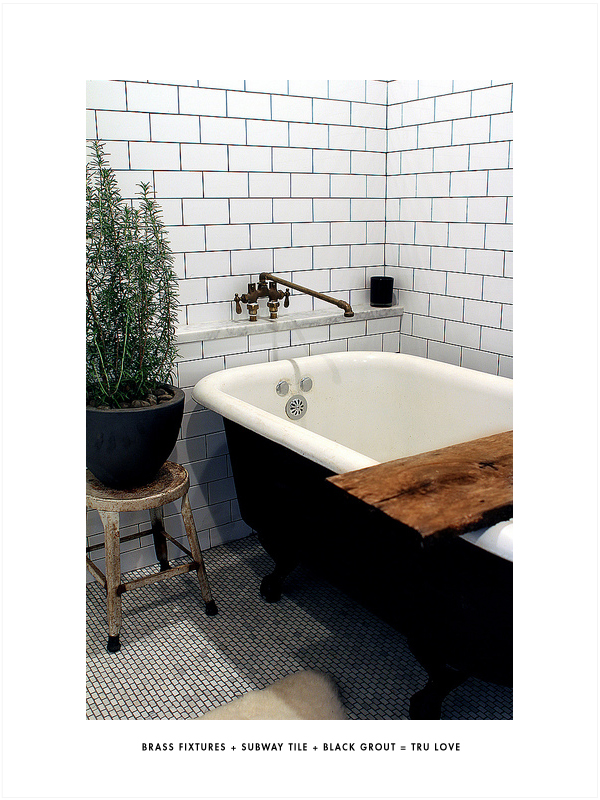
Jeff & Jason’s Home featured on Design Crisis
 |
This Post Has Been Sponsored By Modern Bathroom |





I love the brass towel holder in the first pic, its too good.
This is my ideal bathroom!
I know, isn’t it good?
I really loved clawfoot tubs until we moved into a house with one. Showering in a clawfoot tub is disgusting. It is almost imposibble not to have shower curtain sticking to some part of you. Now, I can’t even look at them without a little bit of hatred.
I can testify that showering with 360 degree shower curtains is the most annoying!
I can totally understand how that would suck, lucky for me, I’m a bath only girl ;)
omg. Too funny. I agree, great too look at but not practical.
私は確かにあなたのために最高だ グッチ 財布,今日のスペシャルオファー
Love this sooo much! great post! I am a fan of the yesteryear look: roll top bath+brass fittings+metro tiles with dark grout= my true love!! I discovered your blog through the apartment therapy post on your kitchen makeover reveal….I think we are kindred spirits when it comes to home design!! Loving the blog!!
Would it be alright if I used one or two of your pictures(The one above of the roll top bath with the metro tiles, and one from your kitchen makeover of the black wall with the window), as inspiration in a post I am doing on how I am planning on making my kitchen and bathroom (actually: the whole house) over?? I will of course link back to your site and credit the pictures!!
My blog is http://nostalgiecat.blogspot.co.uk… nowhere near as gorgeous as yours, but a work in progress…just like my house!!
Wish you a great day!!
xx
Hey June, Sorry for the delay in response. Thank you so much! Yes, feel free to use anything you like from the blog, a link back would be appreciated! I’ll check your blog out, looking forward to it!