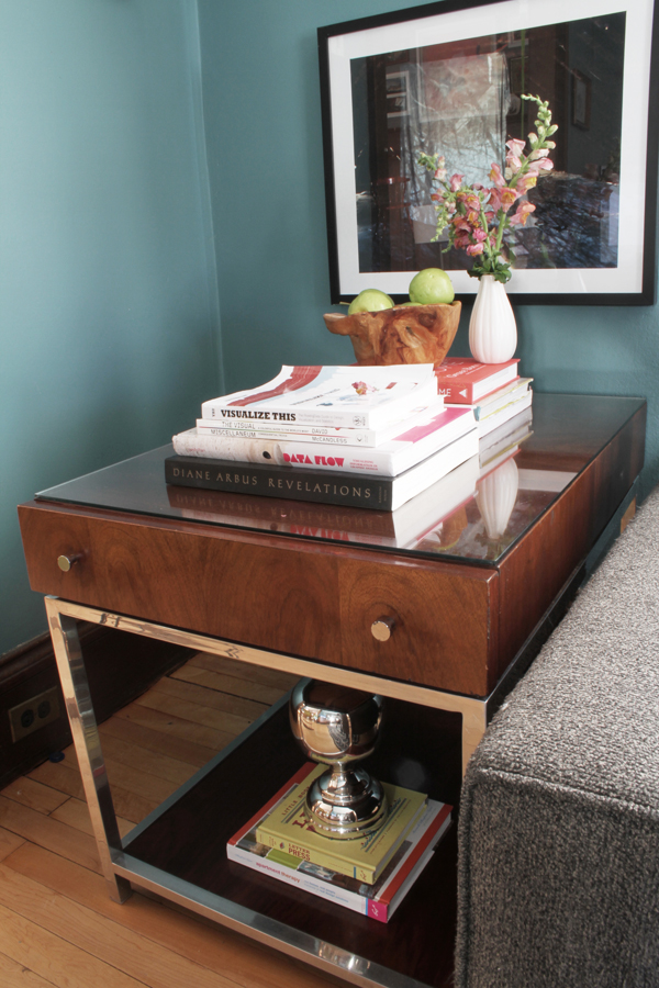
A cool looking side table showed up on craigslist yesterday and I had to jump on it. I’ve been casually looking for awhile but had some pretty strict functionality criteria that made the pool of potential tables small. On top of looking seriously great I needed the table to have a drawer for remotes, small toys, and secret diaper stashes AND I needed open space underneath to easily conceal a toy basket. A mom needs her hiding places. This table did all that stuff.
The table is made by American of Martinsville and was labeled a George Nelson piece in the CL ad, although I’m not quite sure that’s true. I know that it’s controversial that George Nelson actually designed for American of Martinsville and if he allegedly did the pieces I’ve seen on the internets have a ‘X’ inlay in the corners. If anyone has any insight into this I’d love to hear from ya. Anyway, getting off topic here.
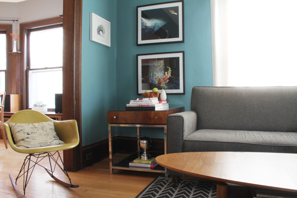
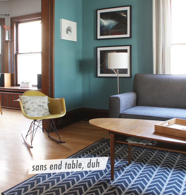
So, like I said, I’ve been looking for awhile, I saw this ad, I liked it, I saw it in real life, I got it. Now it’s here and it’s totally throwing me off. I’m not used to having something in this corner of the living room, it seems huge, but I think it’s all in my head. And chrome, it’s fancy and shiny. I’m not fancy or shiny, can I still hang with chrome? I always envisioned a Saarinen tulip side table for this space but of course, you can’t hide diapers in that. What do you think? Should it stay?






I love it. I have a kid And a tulip side table and it is a tippy mess. You done good!
Ha, I Lol’d a little bit. I suppose you are right about the tippy table – maybe someday when I have grown up kids.
I loooove it! Also I’m super jealous. That’s just the kind of table I’ve been looking for, too! I vote you keep it. Every room should have something shiny.
Thanks for your vote of confidence. I am feeling better about this already! I think I need something shiny too, trying to embrace my inner girl a little bit :)
I love it – plenty of storage and it fits the space perfectly. Although, have you tried placing it either close to the wall or centrally in that space? It might make a difference to how you feel about it. I actually think it makes that corner look bigger but that’s just me! x
Yes, I just moved it closer to the wall, and you are right, it looks much better – good tip. The table is growing on me. I’m glad to hear it makes the corner look bigger!
Keep keep!
OH MY GOD, you read my post!! This just made my day, you are so awesome and funny, and your place is so cool.
Don’t worry, I’m not crazy, I just love your blog.
Thanks for stopping by!
Shucks! Girl please, you’re all up in my RSS reader now. Your blog is the radness and your place looks great!
Somehow I’ve become a crappy commenter, but I’ll try to speak up more! I get shy.
Totally blushing, fer real.
I suck at commenting too, I think I have social anxiety of the internet.
This table is awesome, seriously. It is the perfect amount of fancy and shiny for you!
Thanks lady! It’s grown on me.
I vote for STAYS! Julia stole my thunder by beating me to the “I think it makes the corner look bigger, but maybe that’s just me” comment. Yeah, I was gonna add the “maybe that’s just me” bit too. Like I said, she stole my thunder, verbatim.
But seriously, I LOVE the design and I don’t think it’s too flashy at all. I think it adds just a dash of glam, and even the most modest of us can use a dash every now and then. :)
I agree, I’m trying hard to embrace my inner glam :) Baby steps.
It does make the corner look bigger, you guys are right. Now I just need to find a lamp that works in the space, I suppose that means I’ll have to go shopping soon.. dang.
Babysteps in some ruby red slippers with heels clicking together. “There’s no place like home. There’s no place like home. There’s no place like….”