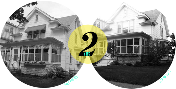
Woah! So all of a sudden it’s been two years since we moved into this bad boy. Holy geez, time flies.
It was just a mere two years ago today that Jeff and I were packing up our tiny rental house and making the short haul down 38th street to our new place. I’m not sure if I had ever been so excited for anything in my whole life. It was a huge deal for us, as it is for most people who buy their first house. Like so many others, we had been hurt by the weak housing market. We bought our first condo in 2004 and the height of the market and then sold it for a loss in 2008. As 20-somethings it was a hard hit and took us a few years to recover. In November 2009 we found our home during an inspired open house visit. We weren’t exactly ready to buy at the time, but once we saw this place we knew we needed that front porch in our lives. We quickly got all our ducks in a row and got an offer submitted. On March 5th we closed and on March 6 we were moving in!
In honor of our first two years I thought I’d put together a little recap to highlight all the work we’ve done on the place.
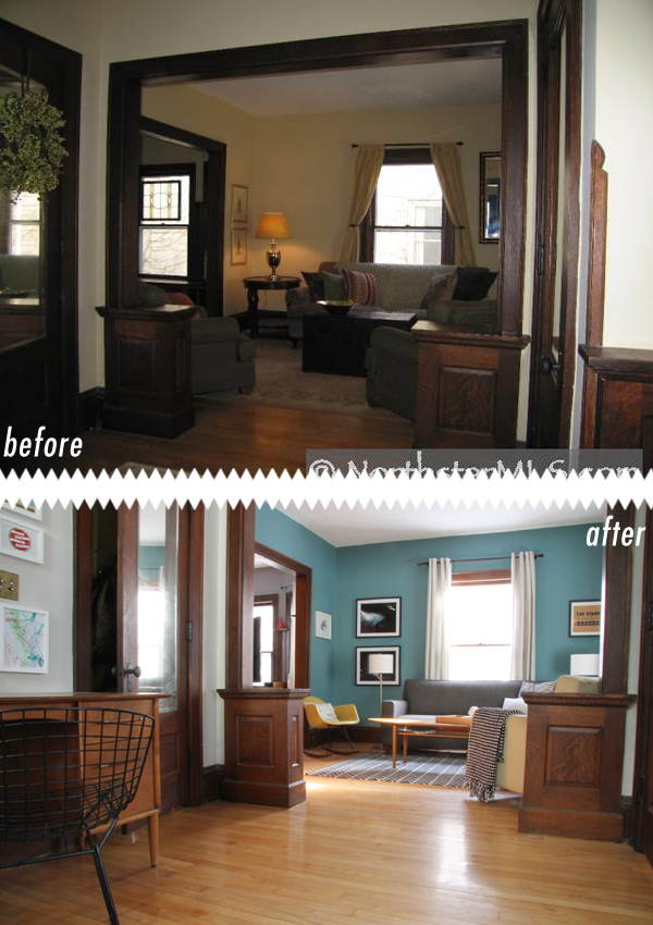
The entry way into the living room.
We really haven’t made a ton of major improvements (“major” meaning, like, tearing down walls). It’s all been paint and furnishings. We’ve painted almost every square inch of the place which instantly made the place better. The walls previously were all painted a not-so-nice off-white probably called “cigarette yellow”. The place was looking really sad and worn out when we first walked through. I’d like to think we gave new life to a 100 year old home; actually I’m pretty certain we did, duh. We painted the entry way a light, light grey, and the living room a teal blue. We bought a new rug, put rocker legs on our Eames chair and purchased a new coffee table.
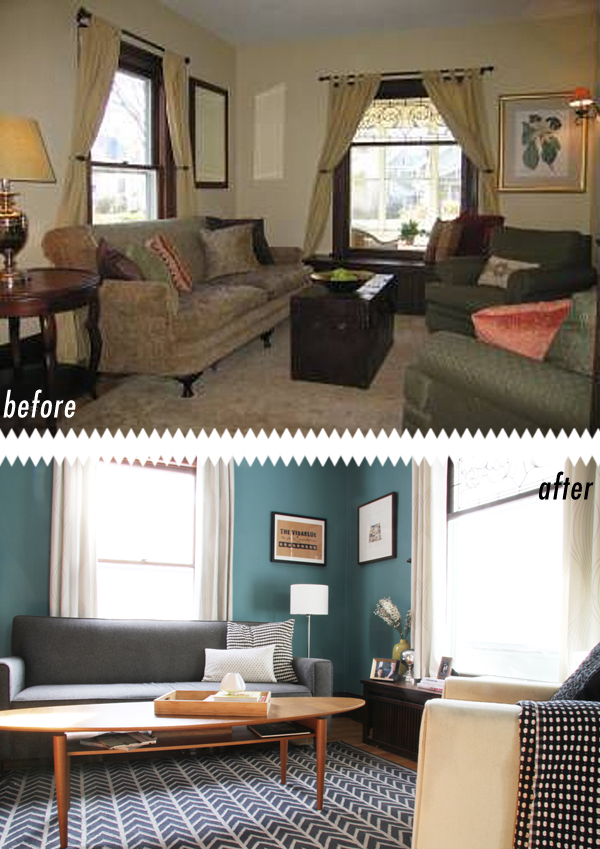
The Living Room
Ahhhhhh, the living room was such a mess before! Full of oversized ugly furniture, and a rug that was way too huge for the space. It was easy to make the room look bigger just by not overcrowding it. We did get all handy and replaced the sconces on the walls (a big deal for us, since neither of us had every touched an outlet). I’m so glad those gross things are gone; they didn’t even turn off, you’d have to unscrew the bulb. Old times.
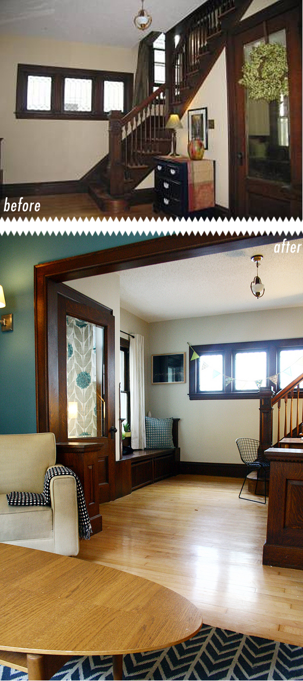
Looking into the entry way
In the winter of 2010 we wallpapered the vestibule in Orla Kiely’s Flower Blossom wallpaper. It’s been one of my most fav additions to the house. The wallpaper adds the perfect pop of pattern in the perfect place and the teal in the flowers matches the paint color to a tee, who would’ve thunk it. We also found a most awesome little desk on craigslist to put in the entry. The entry was such a strange space that we didn’t really know how to furnish it. We love the desk in the space, even though it’s not something you’d typically find in an area like this. And guess what? The desk didn’t come with a chair so I got to get the Bertoia guy to go with it. Dang, love my chairs.
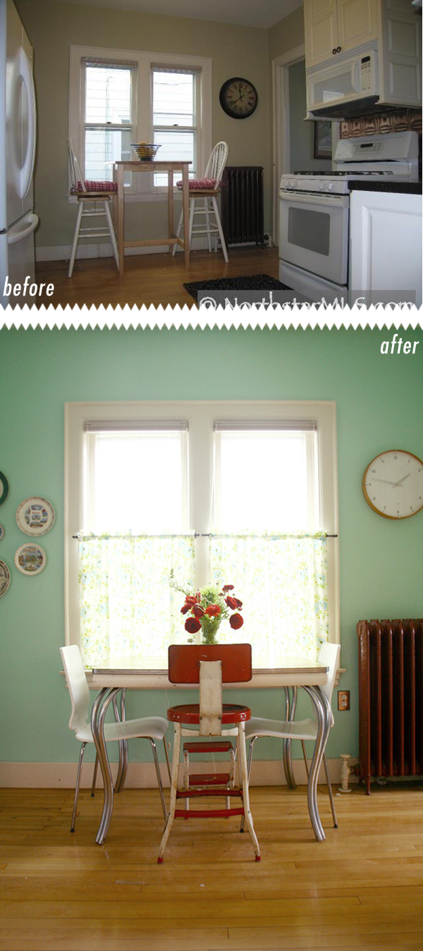
The Kitchen
Oddly enough, the kitchen was the room in the house that we planned on renovating within the first year or two. That hasn’t happened yet and isn’t gonna happen any time soon. The room is really strangely configured. Let me start over. The thing is: the kitchen is a huge space, it’s unfortunately just fractioned up into a bunch of strange compartments and areas. For now, we’ve painted and added a few kitschy embellishments, like our Minnesota plate collection. We still have big plans for this space and some day we will totally gut it, add a main floor bath and deck walkout to the backyard. It’s gonna/gotta happen.
Did you notice I put the clock in the same spot the old owners had their clock, I guess that’s the clock spot.
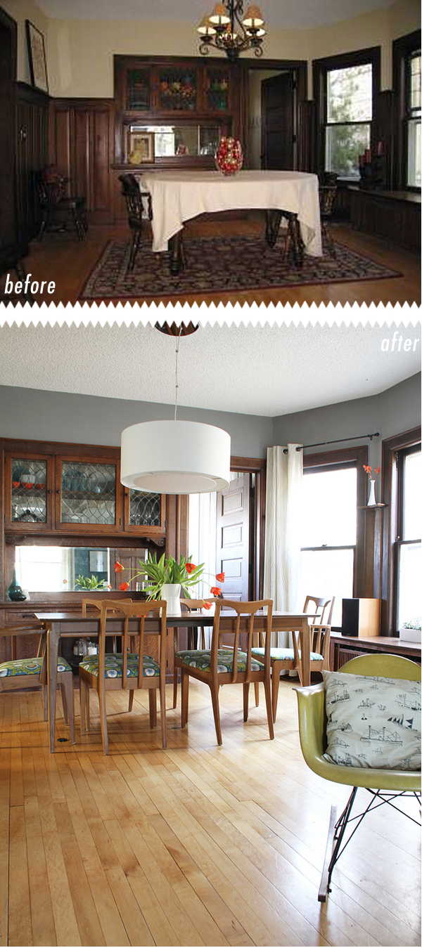
The Dining Room
This room was looking pretty sad, wasn’t it? A great way to make your dark woodwork look even worse is to furnish it with a bunch of ugly dated pieces along with a really horrible orange-emitting light fixture.
The big things we did here; change the light fixture which was previously wired in with speaker wire (seriously), painted the room grey, and wallpapered the inside of buffet. It doesn’t take much to make this room look better.
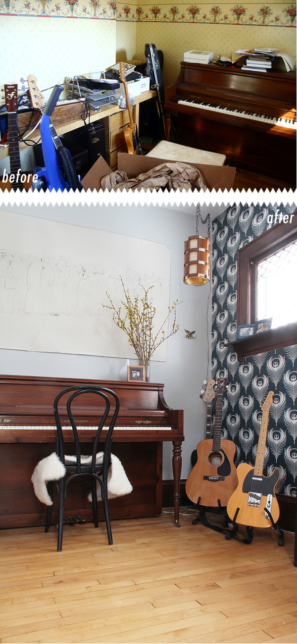
The Music Room
I know I just finished this Music Room project, but here it is again! Look how much better it is now. We’ve probably done the most work to this room. If you’re new to the blog I’ll get you up to speed. We recently removed all the wallpaper, re-plastered and then added new wallpaper (from Ferm Living), painted, hung shelves and added record storage. The place looks a million times better!
Well that concludes this portion of the tour. Stop back tomorrow for the exciting second installment where I recap the porches and second floor bedrooms. Total cliffhanger, I bet you can’t wait. Seriously though, it will be good and awesome.





Hi there! I noticed that you haven’t done a tour of the bathrooms. Are you planning on renovating them as well as the kitchen? We just redid our bathroom so I’m interested in how you would keep it looking right for the period of your house. By the way, I love your blog and am finding myself commenting on many of your posts! Thanks.
Hey Jessica,
Good question. I wish I had a cool bathroom to show off. You’re right, I’ve never posted about the bathrooms, and thats because there is not a whole lot to tell. We have two of them, one is upstairs on the 2nd level and the other is in the basement. The 2nd level bathroom was spiffed up within the last 10 years or so and really isn’t that exciting, nothing is original except the tub :( I have some paint ordered for it and plan on making it more to our liking with new accessories and linens in the very near future. The 2nd bathroom is in the basement. I should mention the basement, also was updated within the last 10 years, but not very well. I’m not kidding, there are two floor to ceiling mirrored walls down there. In these old Minneapolis houses you’re lucky to find a house with a basement finished at all, so we consider it a bonus. The kids hang out down there and they like the mirrors.
We hope that within the next year or two to completely remodel the basement, which would include a new bathroom. I hope within the next 7 years we can do the kitchen, and like I mentioned, there is room to include a bathroom on the main floor. Then maybe someday we will do the upstairs bath.
Sorry, probably a longer answer than you needed.
Thanks for always commenting, I appreciate the feedback and conversation!
Fellow Twin-Citizen here! I’ve been following your blog for a while now, and I’m so impressed with how your home has taken shape! (I’m also seriously jealous of your woodwork, but that’s another story.) My St. Paul home is old as well — 112 to be exact — and I’m thrilled to have your blog as inspiration for updating an older home without losing some of the originality.
Anyway, love everything, and looking forward to seeing more!
Hey! My house is 112 years old too. I’d love to see what other twin cities houses from the same year look like. I’m flattered that I can give you some inspiration. Thanks for following me along!
Did I mention I’m no good at math? 102 years, duh.
Even if they aren’t quite the same age, they’re similar, and I’d be happy to share. :) Once I get my ass in gear and get some decent shots taken (and who am I kidding? I need to actually clean the place first) I’ll post them and send you the link.
Do it! I’d love to see what you got going on.
P.S. I never clean for photos, I just push stuff out of the shot.
holy god
i did not know of your blog but was directed here through twitter
you are going straight into my blog folders and i will read the hell out of this once i have time
love love your style!
Hello! I know this is an old post, but I found it through Pinterest searching for gray paint with dark woodwork! Can you tell me what color gray you used in your dining room! It’s gorgeous!
I’d like to know what grey paint color you used in the dining room as I’m getting ready to paint my kitchen.
Good luck painting your kitchen, the color is Anonymous by Behr.
How did you lighten your woodwork?
Hey Amy, It’s actually not lightened. The before photos were taken by a realtor and I image there was a flash on the camera from the looks of things. It’s all the same woodwork still :)
I love the paint color of you living room. Mine is currently cigarette yellow. Do you mind sharing what color you used?
Hey Stacey! The color currently is Dragonfly by Benjamin Moore, but it used to be Hallowed Hush by Behr, both were similar colors and I loved having them both on my walls. You can’t go wrong!
I am new to your blog and will now be an avid follower (stalker). Would you mind sharing where you got your coffee table and latest bedding in your bedroom? I’m in love with all of it.
Hey Kristin! Welcome to the blog. Thank you so much!! My coffee table is from Ikea and the bedding is from West Elm. Hope to see you around!
What is the colorin the walls of the dining room? This is beautiful!
Hey Whitney, Sorry for the delay in response. The color is Behr ‘Anonymous’. Hope that helps
Hi there,
Great transformation! I’m interested in where you got your blue chevron rug. It’s awesome.
Thanks,
Cheryl
Hey Cheryl, Thanks! Unfortunately the rug is about 5 years old and from Ikea, therefore it’s discontinued, womp, womp. Sorry. If you want to check out ebay search for ‘Jorun Rug’. Hope that helps.
It’s refreshing to see a home with the original trim still in tact–everything online shows paint colors against white trim. Where’s the challenge in that? I’m inspired by your photos to update some of the various shades of cigarette yellow (best description ever, by the way. I’ll never look at our walls in any other way again, thank you very much.) in our 1910 Madison home. You have a great eye.
Thanks so much Mary! These old homes deserve some respect, and although I love seeing white trim in homes that have it, I think that it would be a mistake to paint woodwork that was in nice condition and had survived decades without being painted. It was a huge challenge to pick colors to compliment the woodwork, but I’m really glad that we decided to live with the woodwork after we moved in. I really appreciate it now and feel like it’s one of the things that defines this home. Good luck with your woodwork, and stay warm! It’s cold out there these days!
I just came across your site via Pinterest. I was looking for a color for my living room. With so much dark brown trim, and every room openly connected to each other, I usually try to stay neutral. I love, love, love your living room color, I am glad that you posted the name of it :) My house was built in 1860, when dear Mr. Lincoln was president, the theme of my home is ‘dark brown original trim and a lot of original mahogany floor’. I would love to show a before and after picture of your inspiration. Thank you so much for sharing.
I LOVE this!!! My house has tons of “character” with beautiful dark wood panelling that I can’t bear to paint! My house has similar issues as your “before” – bland colours! Thanks for the inspiration!
I would love to know the brand and the names of the colours you chose! Could you please post those? :)
Love that you didn’t paint the trim. I noticed you mentioned a few of the paint colors. What is the color in the stairwell? Thanks.
Hey! Love your style. Can you tell me the name of the paint colour you used in the living room? We have a 100+ yr old house too with dark wood trim and cigarette yellow walls. Your before picture looks a lot like my living room, and the after picture is making me want to make a big change!
First time reading your post, blog? I love it keeps your interest and easy to read.nice
Undeniably imagine that which you stated. Your favourite reason appeared to be at the net the easiest thing to
take note of. I say to you, I certainly get irked even as people think about issues that they plainly don’t realize about.
You controlled to hit the nail upon the top and also outlined out the entire thing without having side-effects ,
other folks can take a signal. Will probably be again to get more.
Thank you
Could you tell me where you got your dining room lamp???
Hi, fellow dark wood trim here, looking for a good gray. What color did you paint the entryway, it looks fantastic… Thanks for any help! :)
I love your dining room paint color. Can you tell me what it Is? Thanks!
Our house was built in 1879 and is so similar to your own I was actually stricken by these photos. Having only designed newer homes, this was a challenge because of the big, chunky, dark molding around the windows and floor. At first I was out of my element, but I’ve figured some things out since then and am changing the house steadily. I really like the grey in your dining room–what color is it, specifically? I went with a lighter grey, bordering on white, and I don’t care for it at all. We also have a large chandelier in the dining room that is too low and dominates the space too much. I’d like an accent wall with your color, shiplap on the short wall beneath our stairs and a new light…so much to do, and I haven’t even gotten to the stairwell itself. Great job on your facelift and much luck to you..
Hi. What name and brand is the color you used in your living room? I really like it a lot!
I LOVE these colors. About to move into a wood trimmed old house myself. PLEASE let me know the name of that pale gray used in your entryway. I see you already posted the names of the teal and darker gray colors and I plan on using those!! Thanks!
Ok I’ve been looking for months for paint colors for our 1908 Victorian style farm house and yours are some of the first I’ve seen that I love. Like seriously every room. Our oak has managed to survive (well at least on the 1st floor) unscathed and I’ve been struggling for colors. Thanks for the info on the dining and living rooms. Do you mind telling what color you used in the kitchen? Great job all around seriously beautiful job.
Hello! New to this page and have been trying to find the right color for my living room. I have been wanting a darker grey just like your dining room. Can you please share what color it is?? I love it! For my dining room I plan on doing the pretty blue you used in the living room. I have very dark wood I am desperately trying to update without painting it. I love the character it gives but so hard to match it anything or make it a little more modern.
Thanks for the blog and help!!
This blog has been such a huge help to me! Thank you for giving me some inspiration for our 1910 home. We just moved in and it currently looks just like your before pictures. I was curious where you got the curtains you have in the house – I notice the white curtains in the living room and dining room and I think that’s a nice way to brighten the room and hide some of the dark wood without painting over it. If you remember where you got them, I’m all ears! Thanks so much.
Looks great!! Nicely done. Such an improvement. Be gentle with your words on the old decor. Back in the day all that dark, heavy stuff was in believe or not. Fast forward a decade and the next owners will be ripping out what you did thinking uggh what were they thinking!!